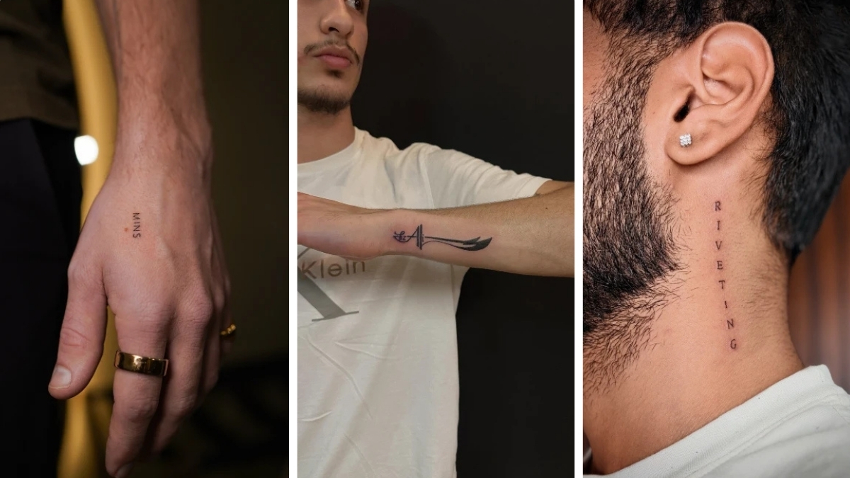
Crisp black ink resting quietly on bare skin carries a distinct weight. A single, sharp line feels deliberate, grounded, and deeply personal. You run your fingers over a healed, minimalist design and realize it speaks volumes without shouting for attention.
Removing heavy shading reveals the raw meaning behind the ink. Guys who want subtle reminders often gravitate toward these stripped-back layouts. Small, precise symbols rest naturally against collarbones or forearms.
Anchor Your Ink Smart Placement Without Clutter
Treating the body like a blank wall requires a sharp eye for negative space. Leaving ample bare skin around a small tattoo makes the dark lines pop instantly.
Strategic placement shapes how the design interacts with your daily life. The inner wrist serves as a constant personal reminder, while shoulder caps act as broader canvases for future additions.
1. Micro Text on the Upper Hand
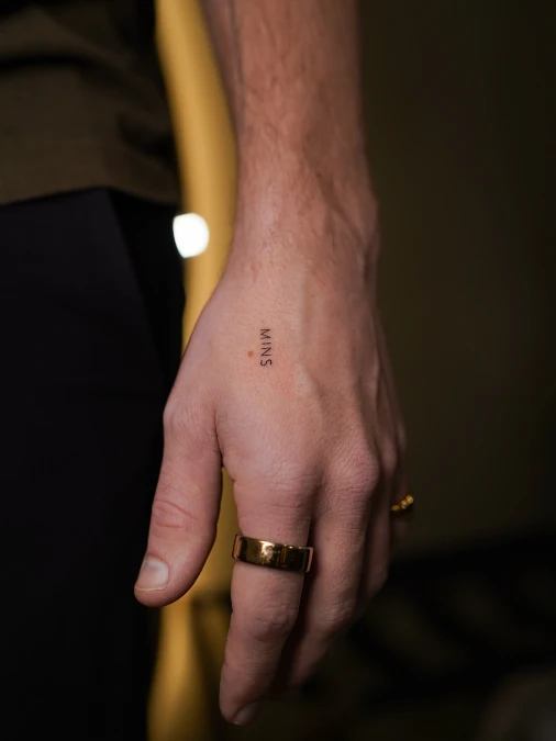
Fine black lines form four crisp letters resting cleanly against warm skin. Soft ambient light highlights the stark contrast between the dark ink and a heavy gold ring. The surrounding bare hand acts as a natural frame for this small piece.
Leaving generous empty space creates sharp definition in highly visible spots.
Placing heavy art directly on the hand often causes visual clutter. A sharp typewriter-style font keeps the layout looking intentional and grounded. Chunky metal accessories easily balance the delicate nature of these ultra-thin strokes.
2. Centered Chest Typography
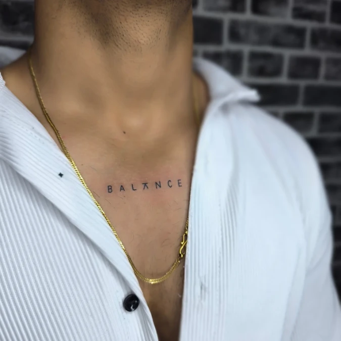
Crisp white cotton frames bare skin to highlight a deeply personal word placed right over the sternum. A delicate gold chain drops smoothly around the stark black lettering, adding a layer of warm metal texture.
Symmetrical placements create a grounded anchor point beneath collared shirts.
This central layout works incredibly well for guys who wear button-downs or open collars regularly. Keeping the font ultra-thin prevents the chest piece from looking heavy or aggressive.
3. Open Flame Hand Contour
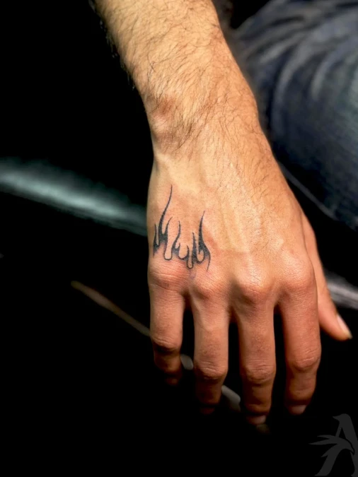
Sharp black outlines sketch an unshaded fire motif stretching across the lower hand. Open shapes allow the warm skin tone to breathe naturally through the design. Subtle shading near the base grounds the artwork without creating heavy visual clutter.
Negative space turns a bold rebel symbol into a highly refined personal accessory.
High-visibility placements demand strict proportion control to look intentional. The hollow structure prevents the ink from reading as a dark smudge from across the room. Anyone wanting a distinct edge without overpowering their daily style can pull this layout off easily.
Why This Works
Element 1: Hollow linework acts like an acrylic coffee table, keeping the overall visual footprint incredibly light.
Element 2: Skipping dense black packing allows your natural complexion to serve as the primary color palette.
Element 3: Following the organic slope of the knuckles ensures the design flows smoothly with physical movement.
4. Horizontal Forearm Text
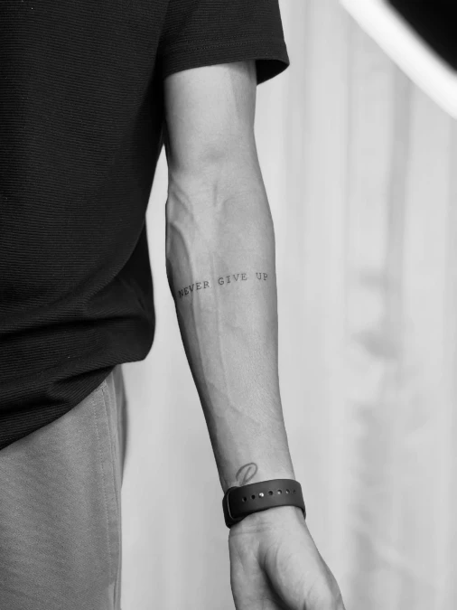
Crisp black lettering stretches horizontally across the bare inner forearm. High-contrast typography sits cleanly against natural skin texture and defined veins. A dark, textured shirt and a matte black smartwatch gently frame the negative space around the ink.
Treating the arm like a long corridor requires centering your text to maintain proper visual weight.
Horizontal layouts act as structural anchors for long, narrow areas of the body. Keeping the font size small prevents words from wrapping awkwardly around the curve of the muscle. Men wanting a direct, highly readable daily reminder often pick this exact spot.
Quick Styling Tips
- Budget version: Outline-only typography gets you out of the artist’s chair quickly, keeping costs low.
- Renter tip: Wear a temporary ink transfer in this exact location for a week to test the daily visibility.
- Pro move: Ask your artist to slightly widen the space between letters to prevent the ink from blurring together over the years.
5. Scattered Forearm Gallery Wall
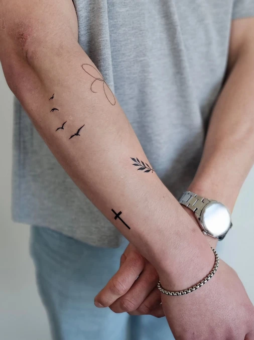
Several small black ink designs dot the clear skin of an outer forearm. Crisp silhouettes of flying birds contrast sharply with a soft, ultra-thin wireframe shape near the elbow.
Treating an arm like a blank gallery wall allows for a cohesive collection of unrelated moments.
Spacing tiny flash pieces evenly across a wide area prevents heavy visual clustering. This layout style suits guys who prefer collecting small memories gradually over years.
6 Clean Serif Lettering Above Heavier Ink
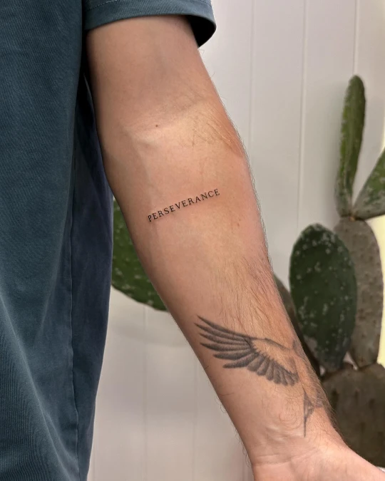
Crisp black characters spelling out a firm reminder rest quietly on the mid-forearm. A traditional serif font lends a grounded weight to the otherwise thin and airy linework.
Leaving distinct negative space between contrasting tattoo styles prevents your arm from looking cluttered.
Placing fine typography near a larger piece requires a deliberate gap to let both designs breathe. The inner forearm offers a flat, stable surface that keeps long words highly legible.
7. Blade And Calligraphy Motif
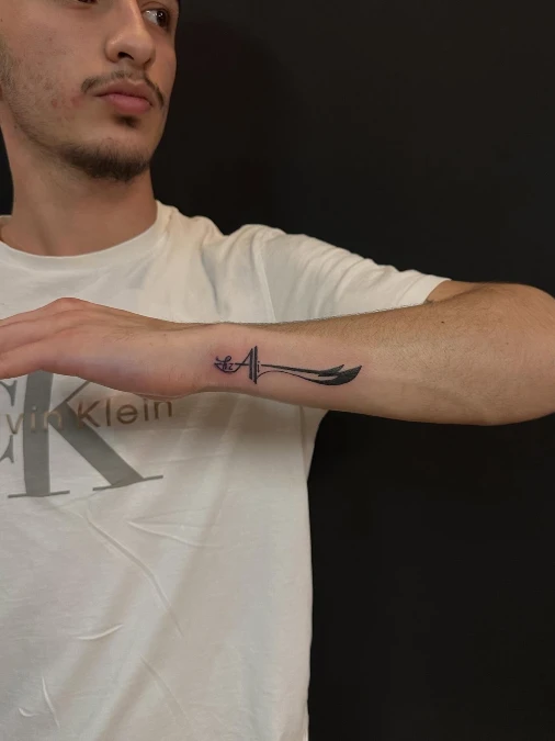
Dark black ink sweeps across the outer wrist in a continuous fluid motion. Sharp split tips anchor one side while curved script forms the hilt. A crisp white t-shirt creates a bright background, forcing the rich pigment to pop directly against the forearm.
Merging text with a recognizable shape reduces visual clutter while maintaining strong personal meaning.
The outer edge of the arm provides a sturdy flat plane for horizontal artwork. Guys who talk with their hands often choose this highly visible spot. Combining a sleek symbol with custom lettering keeps the overall footprint incredibly narrow.
Why This Linear Structure Works
Element 1: Solid black shading on the points adds necessary weight to balance the delicate writing.
Element 2: Placing the artwork over the bone structure ensures the long lines stay completely straight.
Element 3: Wrapping the script into the handle prevents the need for a separate text block.
8. Sliced Dagger And Text Motif
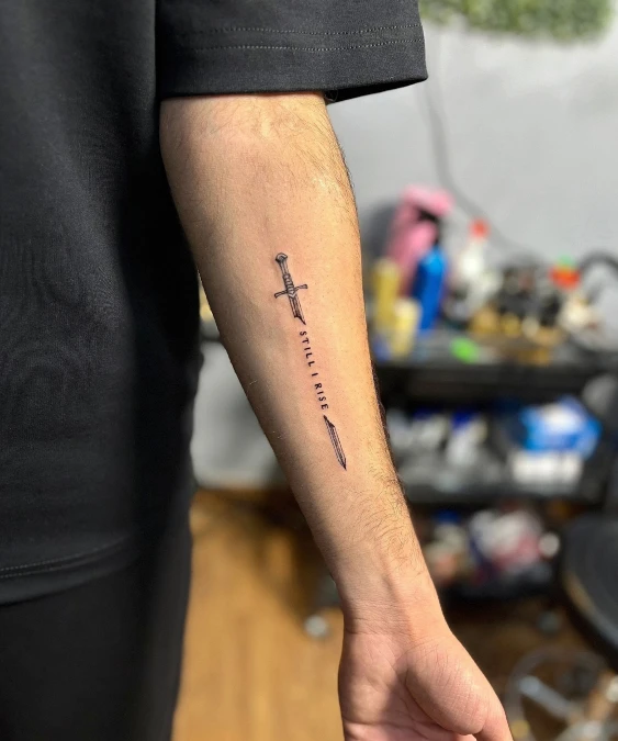
Sharp black ink sketches a shattered sword resting vertically across the outer forearm. Crisp block letters fill the deliberate gap between the separated hilt and blade tip. Soft ambient lighting highlights the precise dot-work shading along the weapon’s structured handle.
Treating negative space as a canvas allows typography to become the main focal point.
Breaking a tall vertical element creates a natural framing device for meaningful quotes. This narrow linear layout elongates the arm visually without wrapping awkwardly around the muscle.
Quick Styling Tips
- Budget version: Stick to pure outline work for the dagger to lower the overall cost in the chair.
- Renter tip: Test the alignment with a skin-safe marker to see how the words read when you naturally twist your wrist.
- Pro move: Ask the artist to slightly thicken the letter strokes to match the heavy visual weight of the black hilt.
9. Vertical Script Neck Placement
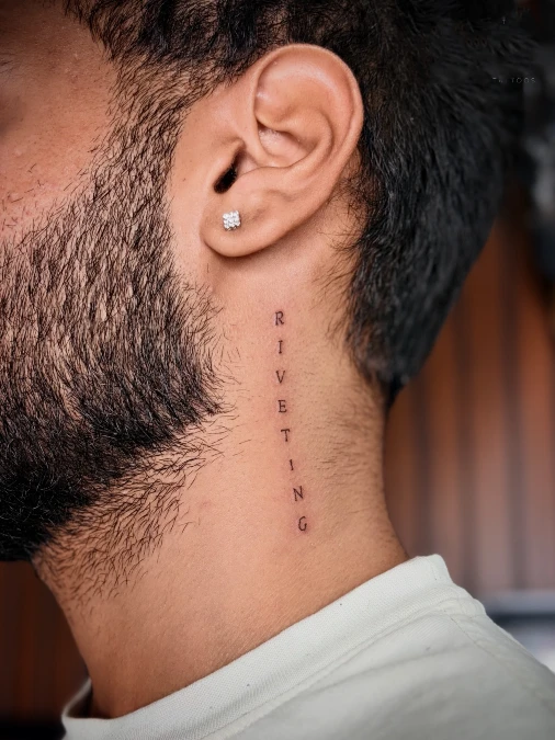
Sharp black lettering runs down the side of the neck in a clean, vertical line. The serif font sits right below the jawline, catching soft light against the skin. Dark ink contrasts boldly against the warm, natural complexion, creating a focal point that follows the neck’s length.
Vertical text follows the body’s natural lines to create an elongated, intentional look.
Neck placement requires commitment, but a narrow vertical layout feels refined rather than aggressive. Keep the lettering height consistent to match the underlying bone structure. This style works for guys who want a bold touch that remains sharp and readable from the side profile.
Quick Styling Tips
- Budget version: Use single-line text to reduce your session time in the chair.
- Renter tip: Test the placement with a temporary sticker to monitor how the ink appears with your daily wardrobe.
- Pro move: Align the text carefully with the neck muscles to avoid distortion when you turn your head.
10. Minimalist Mountain Landscape
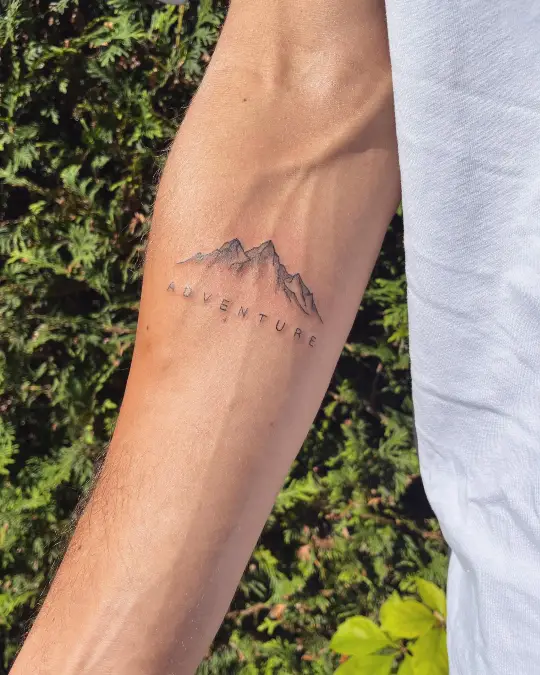
Landscape Art and Typography
Fine, intricate black lines sketch out jagged mountain peaks sitting directly above spaced-out lettering. Soft, subtle shading adds necessary depth to the slopes without relying on heavy, dark blocks of color. Natural green foliage in the background mirrors the outdoor theme, creating a grounded, outdoorsy vibe against the skin.
Combining illustrative art with clean typography creates a balanced, story-driven design.
Placing a horizontal landscape utilizes the forearm’s natural width for a panoramic feel. Keep the lines delicate and consistent to ensure the scene stays crisp over time. Choosing a lightweight, sans-serif font helps the text complement the thin mountain peaks rather than competing with them.
11. Red Accent Symbol Replacement
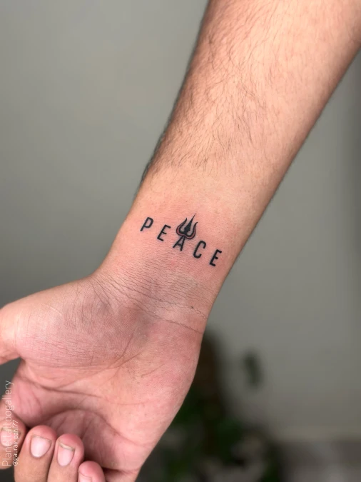
Crisp black lettering stretches cleanly across the warm skin of the inner wrist. A sharp strike of red ink outlines the central trident, bringing a restrained, quiet luxury feel to the bare layout. Gentle overhead lighting emphasizes the airy negative space separating every character.
Swapping one standard letter for a structural icon builds a distinct focal point instantly.
Applying smart spatial zoning to your lower arm leaves the forearm completely open for a future geometric sleeve. The inner wrist acts much like a home entryway, creating an immediate visual impact that you can easily cover up with a tailored shirt.
12. Crisp Bird Hand Placement
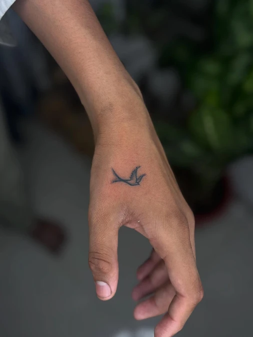
Dark ink forms a solitary bird in mid-flight across the bare skin of the outer hand. Soft background greenery highlights the sharp, swooping lines of the tiny silhouette. Keeping the design completely unshaded allows the warm natural complexion to act as the primary filler color.
Strategic negative space turns a tiny design into a striking, high-visibility focal point.
Placing a delicate piece near the thumb joints draws the eye immediately without visually shrinking a larger, wider frame. You can effortlessly build around this distinct placement later. Leaving the upper arm wide open provides a massive blank canvas for heavier, structured geometric sleeves down the line.
Why This Works
Element 1: Sharp, unshaded outlines keep the overall visual weight incredibly light against the hand.
Element 2: Tucking the ink near the thumb joint anchors the artwork exactly where the skin naturally bends and moves.
Element 3: Utilizing pure dark pigment guarantees maximum contrast against warm skin tones.
13. Geometric Tricep Silhouette
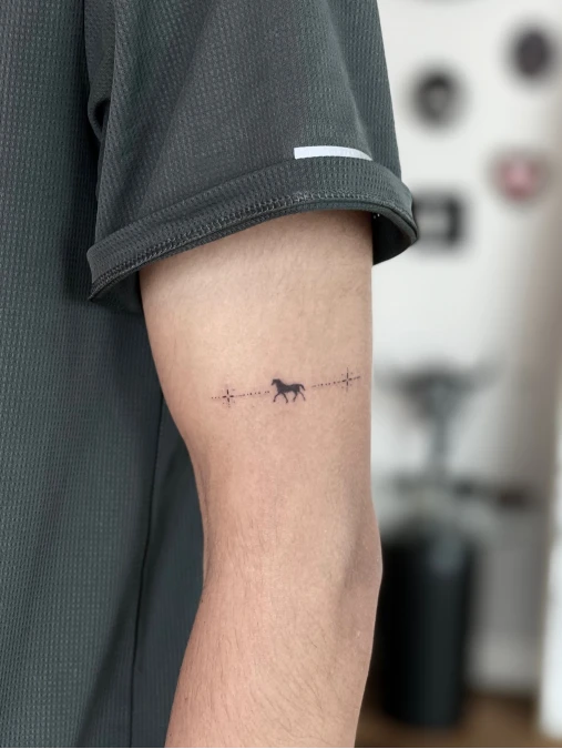
Crisp dark ink forms a tiny, running horse across the bare tricep. Delicate dotted lines stretch outward from the center, finishing with two minimalist starbursts. Soft shadows from the athletic grey shirt sleeve fall naturally over this highly precise layout.
Treating the back of the arm as a horizontal canvas adds unexpected movement to a static design.
Placing ink behind you keeps the artwork entirely out of your daily view. Guys building out geometric arm sleeves frequently use these thin horizontal bands to break up heavier future pieces.
Quick Styling Tips
- Budget version: Drop the outer stars and dotted lines to minimize your total session time.
- Renter tip: Draw a similar line with a skin-safe marker to test how the placement shifts when you flex.
- Pro move: Center the band perfectly on the muscle so the design avoids warping on large frames under tailored clothing.
14. Centered Hand Dragon Motif
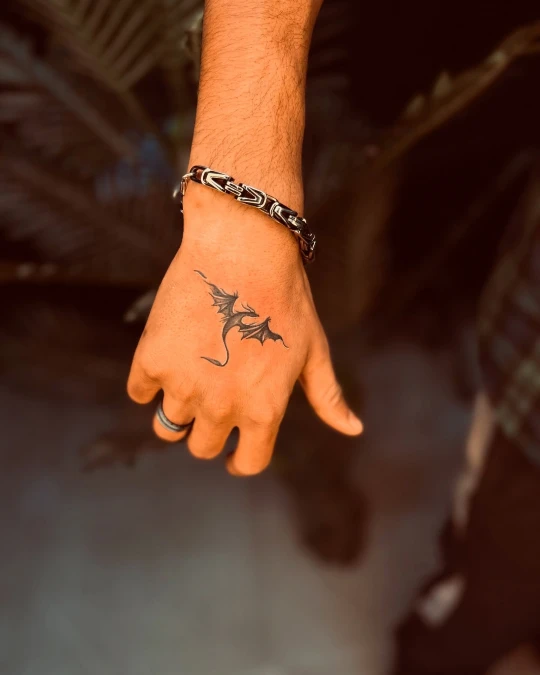
Deep black ink shapes a small winged creature resting exactly in the middle of the hand. You can see how soft amber light creates a rich backdrop for the sharp, pointed tail. A chunky metal chain bracelet grounds the wrist with heavy, rugged texture.
Applying strict spatial zoning to your hand prevents delicate linework from feeling cramped.
Leaving wide borders around a central focal point works exactly like floating a couch in a minimalist living room. Center the artwork squarely on the flat plane to keep the wings highly readable from any angle. This strict, dark color formula mirrors the calm restraint found in quiet luxury interiors.
15. Minimalist Ankle Tightrope
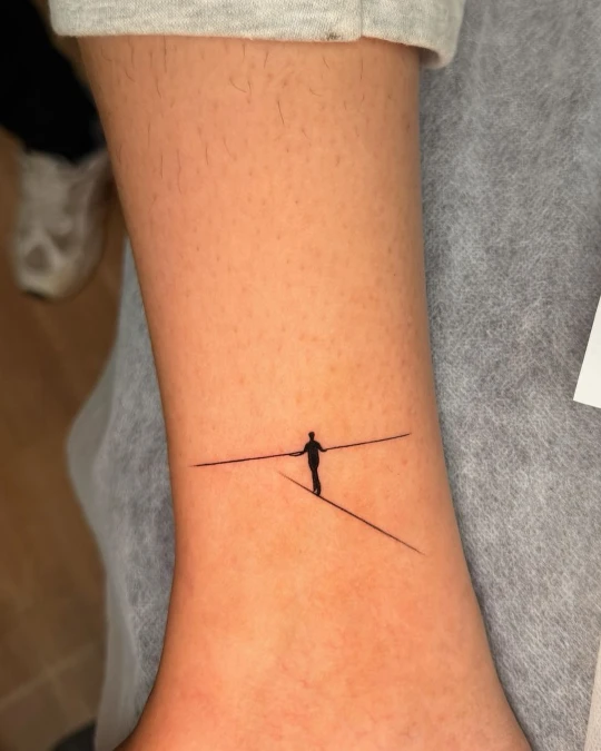
Crisp black ink sketches a tiny silhouette balancing on intersecting thin lines near the lower ankle. Soft natural lighting warms the bare skin, creating a high-contrast canvas for this delicate, thread-like artwork.
Treating bare skin as negative space gives micro tattoos room to breathe.
Keeping the linework ultra-thin prevents the ankle area from looking visually heavy. This airy layout mirrors the spatial restraint found in quiet minimalist studio apartments.
Why This Works
Element 1: Using thread-thin strokes keeps the overall visual footprint incredibly light and understated.
Element 2: Intersecting horizontal and vertical lines build structural balance without requiring solid shading.
Element 3: Leaving the surrounding calf entirely bare turns the leg into a clean, gallery-like backdrop.
16. Symmetrical Antler Neck Placement
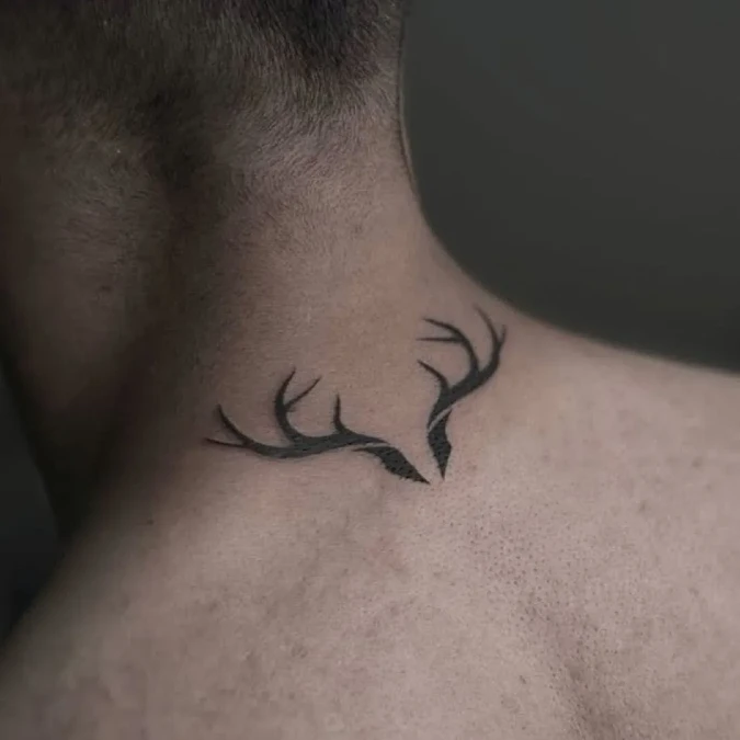
Crisp black ink forms a split set of antlers resting cleanly against the lower neck. Subtle gradient shading anchors the base of each horn with heavy visual weight. The surrounding bare skin acts as a warm, earthy backdrop that lets the sharp points breathe naturally.
Applying strict symmetry anchors a dark design firmly against a wider upper body.
Centering artwork right on the spine mimics the structural balance of a living room fireplace. Guys with broader shoulders benefit heavily from this grounded layout because it pulls focus directly inward. Leave the upper back completely empty to maintain an airy, uncrowded feel.
17. Geometric Chevron Hand Sequence
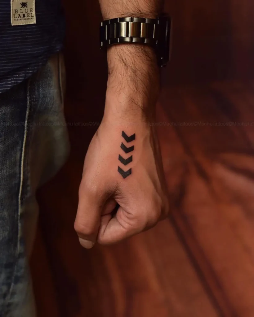
Four thick black arrows march straight down the outer hand toward the knuckles. Dense pigment creates a strong, structured line against the warm natural skin. A heavy metal watchband introduces cool, rugged hardware right at the base of this bold pattern.
Repeating a single strong shape builds immediate visual rhythm without cluttering a narrow space.
Structuring geometric motifs in a direct sequence mirrors the sharp, controlled lines of well-tailored apparel. Guys planning larger geometric sleeves frequently use these heavy directional markers to firmly anchor the wrist. Keep the outer edges entirely crisp so the ink reads like a deliberate architectural choice.