A bold line of ink down the back commands attention. Living with this striking visual feels like anchoring a bare room with a dark, moody centerpiece. Heavy black work catches the light. Fine linework moves with the muscle.
This structured approach works hard for the minimalist at heart. Guys who prefer clean lines thrive with this placement. The spine offers a natural focal point for sharp symmetry.
Anchor Your Canvas Linear Designs That Command Respect
Treating the back as a blank wall requires thoughtful balance. Vertical elements draw the eye down to create a sense of grounded stability.
Placement matters more than complex shading here. Sharp geometric shapes act as strong architectural anchors for your personal style.
1 Dark Gothic Ironwork Spine Cross
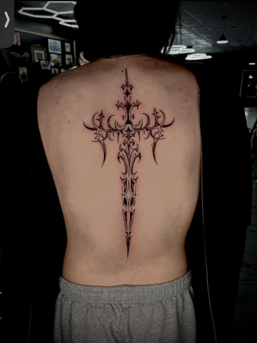
Deep black ink etches a vertical cross down the center of the back, echoing the sturdy strength of wrought-iron gates. Sweeping gothic curves and sharp barbs add a raw, grounded texture to the smooth skin.
Strong central alignment builds immediate authority and anchors the entire look.
This structural placement uses your spine’s natural architecture to set up an unshakeable focal point. Guys wanting a powerful statement piece will appreciate this layout since it stays completely private under a regular t-shirt.
2. Wings and Dagger Spine Accent
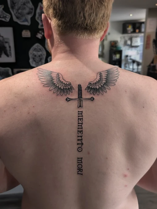
Symbolic Alignment Anchoring the Back
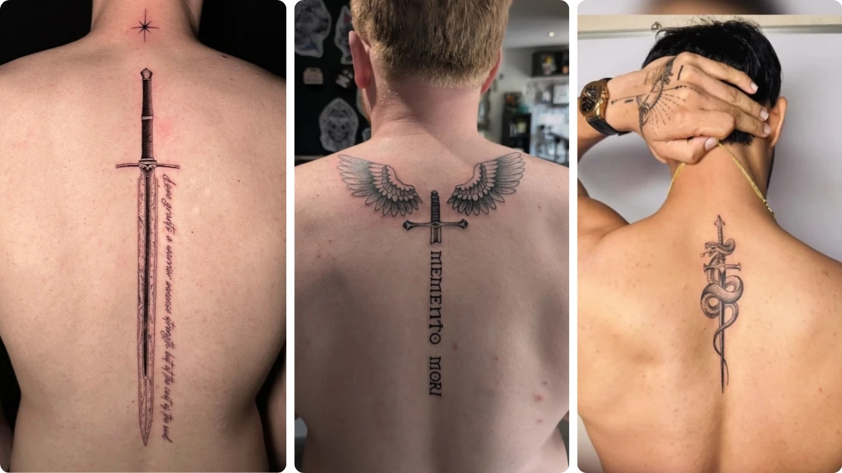
A striking illustrative piece, this tattoo combines crisp black-and-grey wings with a detailed central dagger. The hilt sits precisely between the shoulder blades, providing perfect symmetry, while the blade becomes the foundation for stacked, classic serif lettering reading “MEMENTO MORI.”
Bold symbols and strong lettering need clean vertical lines to truly intimidate.
This design anchors the upper back with significant visual weight while using the natural line of the spine for the text. It balances the broad, feathery texture of the wings with the sharp geometry of the dagger and lettering.
3. Narrative Anchoring The Central Spine Statement
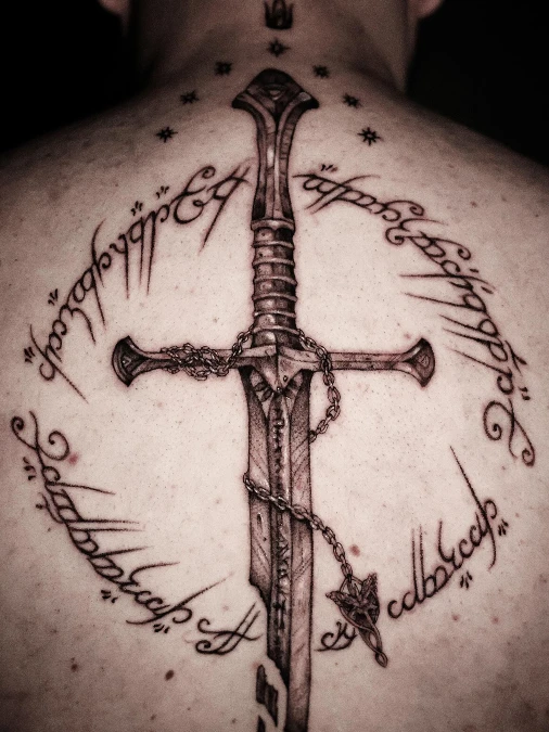
Visual Harmony and Textural Depth
A fractured yet noble sword, much like the one seen in anchors the central spine in rich, detailed black ink. Delicate, looping Elvish script forms an oval frame around the broken blade, adding sophisticated movement that contrasts sharply with the sword’s angular power.
Narrative texture turns a simple placement into a layered conversation piece.
Centering a fragmented design creates instant visual tension, making it a strong choice for men with an architectural approach to body art. This layout works exceptionally well on defined backs where the negative space of the script oval lets the musculature pop.
4. Minimalist Fine Line Tree And Geometric Drop
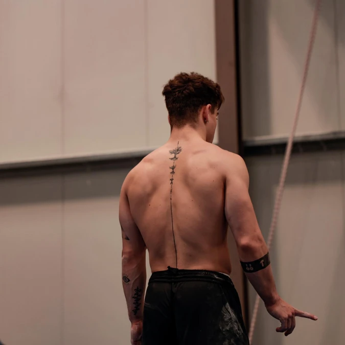
Clean Vertical Lines For Broad Shoulders
Delicate tree branches anchor the top of the back in victor just below the neck. A crisp dark line drops straight down the center with tiny dots breaking up the empty space. Clean ink lines look sharp and earthy against bare skin.
Raw minimalism makes a quiet space feel instantly grounded.
This setup acts exactly like a long vertical mirror in a narrow hallway. Drawing the eye downward makes the whole area look taller and more structured. Try this placement if you prefer quiet luxury over loud heavy centerpieces.
5. Eagle Motif With Long Tail Line
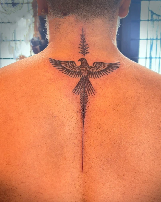
Crisp black wings stretch wide across the upper shoulders in dreamcatcher. The sharp geometric tail drops straight down the middle of the back. A leafy fern design rests just above the bird head on the bare neck.
Strong horizontal wings balance out a very long vertical drop.
This wide top shape acts like a large headboard in a primary bedroom. You get solid visual weight up high where your shoulders are broadest. Guys with wide frames benefit from designs that stretch out before pointing down toward the lower back.
Why This Works
Wide wings act as a strong visual anchor for the upper back.
A single thin tail pulls the eye straight down the spine.
Soft leaf shapes on top balance out the hard ink lines below.
6. Clean Sword With Asymmetrical Text
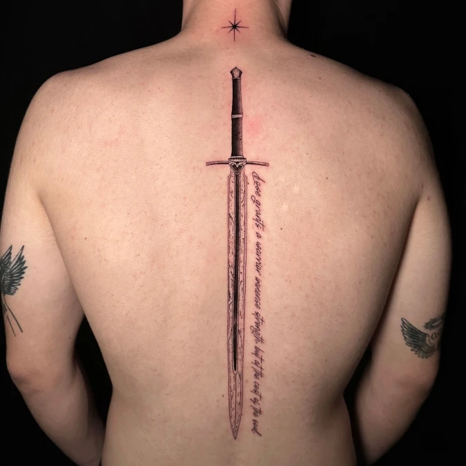
Crisp black ink forms a sharp sword straight down the middle of the back in showtime. A single line of text drops right next to the blade to create quiet tension. High on the bare neck sits a tiny star like a small brass light fixture.
Off center elements bring quiet energy to very structured spaces.
This layout works well for guys who want a strict center anchor with a slight rebellious edge. Placing text on just one side acts like putting a tall plant next to a heavy fireplace. You get solid balance without feeling too stiff or formal.
Quick Styling Tips
Budget version Start with just the center weapon and add the side text later.
Renter tip Use a temporary ink transfer to test the text placement before getting the real piece.
Pro move Match the lettering font to the historical era of the weapon for a grounded feel.
7. Winding Snake And Sword Centerpiece
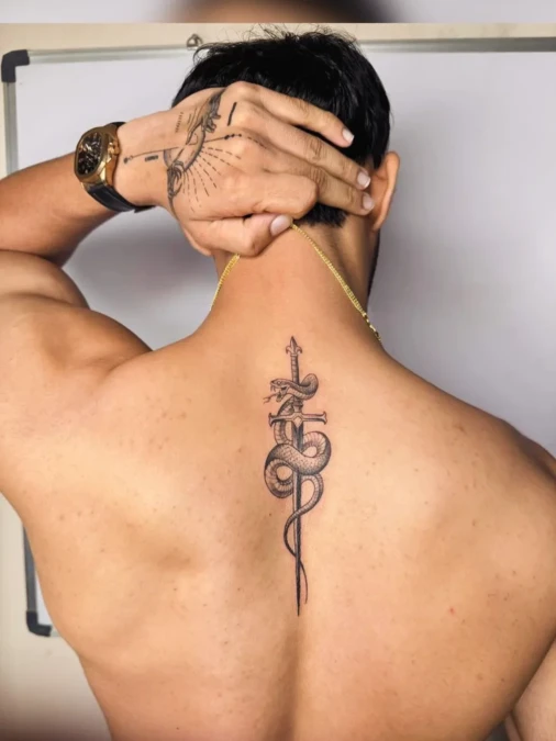
A coiled snake wraps tightly around a sharp metal blade in tattoo myth. Dark ink creates deep shadows against the warm bare skin. The straight metallic structure grounds the organic twisting curves of the reptile.
Mixing rigid structures with flowing organic shapes creates immediate visual balance.
This design trick works just like placing a soft chunky blanket over a rigid leather chair. These opposing elements stop the artwork from feeling too stiff. It looks great on plus size men because the wide winding curves fill out broader upper backs.
Quick Styling Tips
Budget version. Start with the straight weapon outline and add the reptile shading in a second session.
Renter tip. Print out a temporary transfer sheet to check the exact placement on your spine.
Pro move. Keep the central blade completely vertical to maintain a strong structural anchor.
8. Wreath Arch And Vertical Lettering Drop
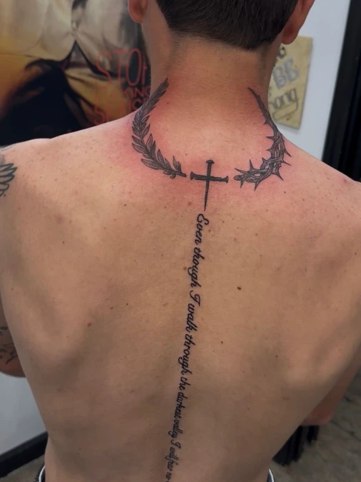
A dark wreath of thorns and leaves curves around the lower neck. Crisp black script falls straight down the spine below a small ink cross. Bare skin acts as a warm backdrop for this highly structured design.
Grounding a long vertical line with a wide top arch creates solid visual balance.
This layout works just like hanging a wide light fixture over a long wooden table. You anchor the upper body before pulling attention straight down the center. Plus size guys can use this exact setup to give their broad backs clear definition.
9. Heavy Winged Warrior And Interlocking Thorns
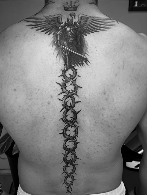
Deep black ink forms a dark winged knight at the top of the back. Thick thorn circles lock together and drop straight down the center line. Rough shapes give this design a raw and moody feel against bare skin.
Dense shading anchors the body just like dark matte paint grounds a large room.
Heavy ink needs a wide canvas to look planned instead of cluttered. This thick layout works very well for plus size men wanting large elements to match their broad frames.
10. Heavy Symmetrical Gothic Spine Ink
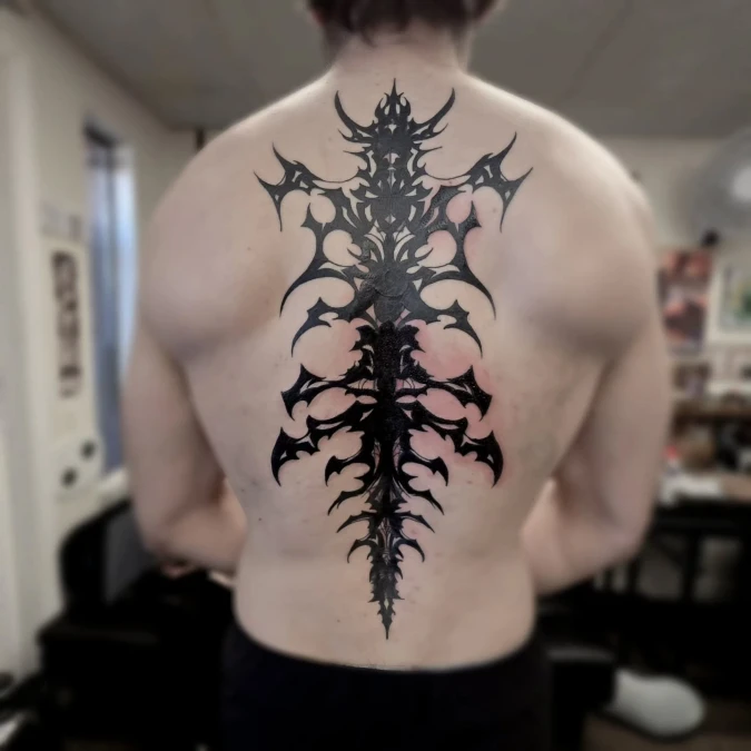
Thick dark ink fills the upper back. Sharp gothic points reach down the center spine like raw iron fencing. Leaving bare skin between the solid shapes creates intense visual contrast.
Heavy symmetrical patterns ground wide frames exactly like a dark painted accent wall anchors a massive bedroom.
Large scale artwork needs plenty of physical space to look intentional rather than crowded. Plus size guys carry this heavy structural style well because the wide top matches broad shoulders.
Why This Works
Element 1 Solid black shapes build massive visual weight right in the center.
Element 2 Pointed edges draw attention outward toward the shoulder blades.
Element 3 Uninked negative space keeps the heavy design feeling balanced.
11. Broken Sword And Floating Text
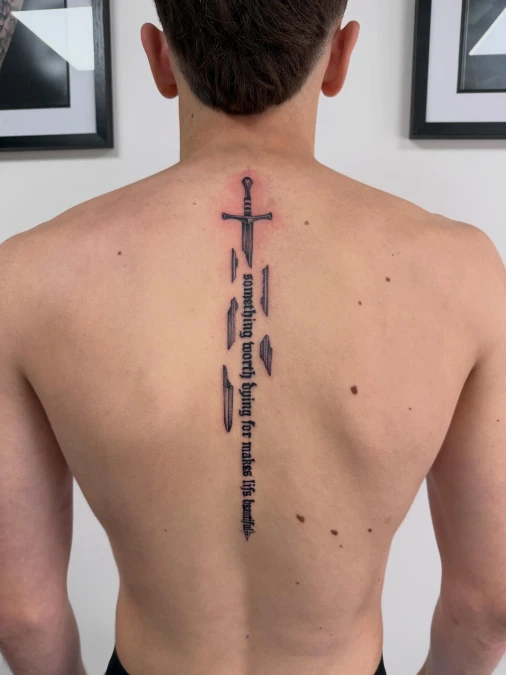
A dark sword handle sits right between the shoulder blades. Sharp metal pieces float away from the broken blade. Crisp gothic text drops straight down to finish the weapon shape against bare skin.
Breaking a solid line into pieces keeps a large center design from feeling heavy.
This fractured layout works exactly like hanging a group of small frames on a bare wall. You get strong visual interest without blocking out the entire space. Plus size guys carry this layout well because the floating lines draw the eye down instead of side to side.
Quick Styling Tips
Budget version Start with the solid sword hilt and add the text pieces months later.
Renter tip Draw the lettering on paper first to check how long you want the drop to be.
Pro move Keep the floating metal shards very dark to match the heavy top handle.
12. Realistic Ripped Skin And Exposed Bone Structure
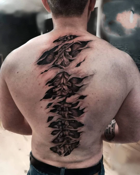
Dark ink creates the clear illusion of torn flesh straight down the back. Jagged edges open up to show deeply shaded vertebrae hiding underneath. Deep contrast makes these bone shapes look thick and highly textured against the bare canvas.
Exposing raw structural elements gives any smooth surface a massive industrial edge.
This realism technique acts exactly like leaving original brick exposed in a modern loft. You highlight the strong natural foundation sitting right below the surface layer.
Quick Styling Tips
- Budget version. Ask your artist to outline the outer tears first and fill the deep bone details later.
- Renter tip. Tape a printed paper template to your spine to see exactly how much space it covers.
- Pro move. Keep the central bones totally straight to maintain a strong architectural anchor.
13. Heavy Geometric Shapes And Downward Arrows
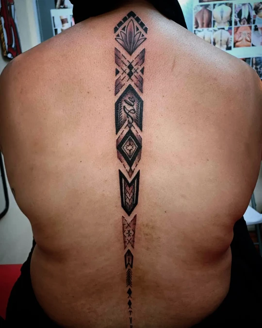
Thick black ink forms large geometric diamonds and sharp chevrons straight down the spine. The wide top pattern slowly tapers into a very thin arrow pointing toward the lower back.
Gradual tapering creates a very strong focal point while maintaining heavy visual weight.
This structured layout acts exactly like laying down a wide geometric runner rug in a long hallway. Drawing attention straight down the center makes the whole area look taller and more grounded.
14. Stacked Tribal Faces And Swirling Patterns
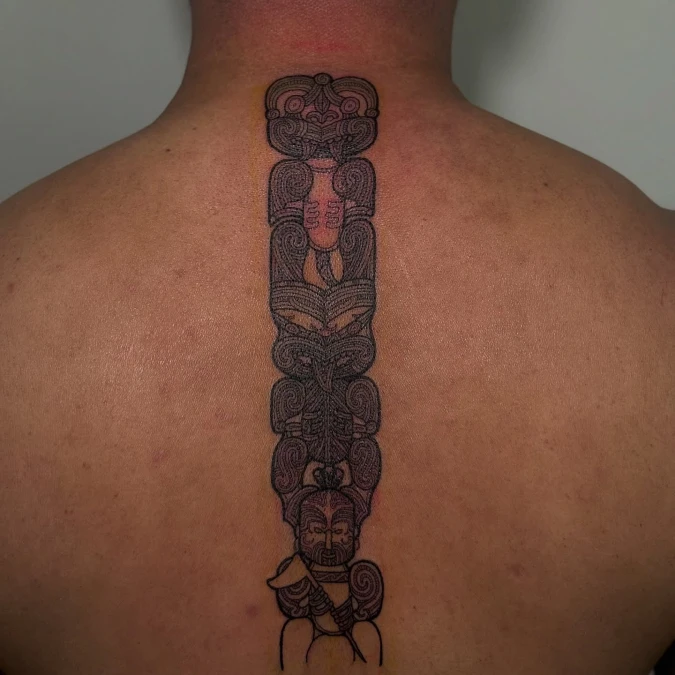
Dark swirling lines stack tightly together to form detailed faces down the spine. Dense grey shading adds a soft plush texture to the rigid vertical block. Warm bare skin surrounds the heavy ink to keep the intricate design from looking crowded.
Grouping highly detailed patterns into one solid column creates a clean and organized focal point.
This thick stacked layout acts exactly like placing a tall wooden room divider in a minimal studio apartment. You gain rich visual interest without making the rest of the area feel cluttered.
15. Realistic Torn Skin And Labeled Medical Bones
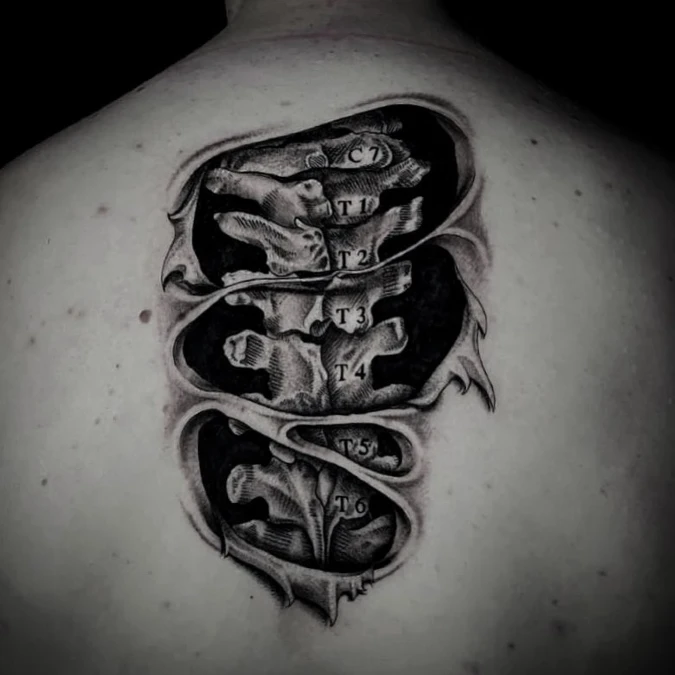
Deep black shadows create the illusion of torn flesh right between the shoulder blades. Crisp anatomical letters mark each bone like a printed architectural blueprint.
Exposing your raw structural framework gives soft surfaces an instant gritty edge.
This medical layout acts exactly like pulling down drywall to show old brick underneath. You highlight the natural support system instead of hiding it away. Plus size men can wear this blocky design easily because the wide shape fits their broad shoulder structure.
Why This Works
Element 1 Thick black shading builds deep visual depth that makes the light bones pop forward.
Element 2 Clear text labels give the artwork a very grounded and planned scientific feel.
Element 3 Horizontal skin tears break the long vertical column into smaller and manageable sections.
16. Stacked Geometric Symbols And Soft Shading
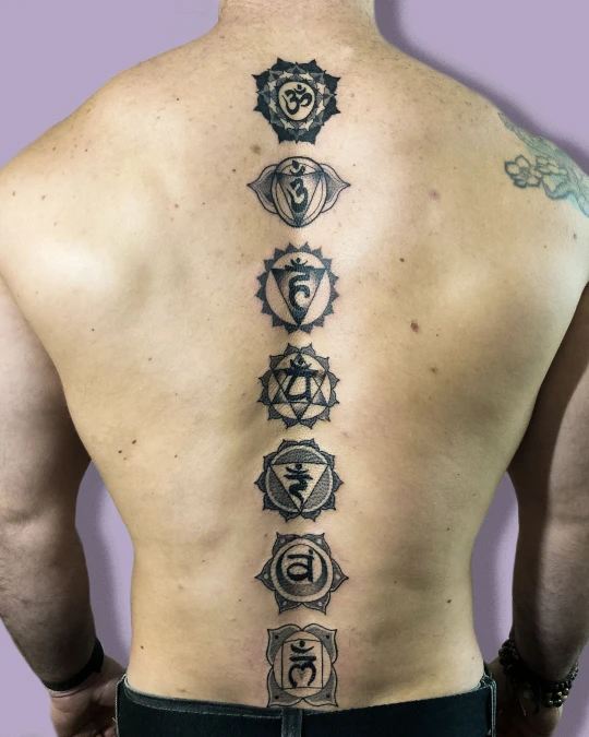
Seven detailed geometric shapes rest in a straight line down the bare back. Crisp black ink outlines each distinct circle and lotus petal pattern. Soft grey shading gives the flat designs a warm textured depth against the skin.
Stacking uniform shapes creates a very calm and grounded vertical rhythm.
This organized layout works exactly like hanging a matching set of square picture frames down a narrow hallway. You build a strong focal point without creating chaotic visual noise.
17. Clean Sword And Minimalist Lines
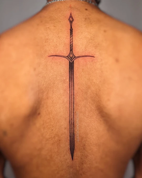
A long dark blade points straight down the bare back. Sharp cross guards stretch out horizontally across the upper spine. Warm skin tones soften the raw metal ink to create a very crisp look.
Strict vertical shapes act like a quiet anchor in an empty room
This bare layout works exactly like placing a single tall plant on a wide dining table. You create immediate focus without generating heavy visual noise. Plus size men carry this sharp design very well because the wide top matches broad natural shoulders.
Why This Works
Element 1 The wide crossguard provides a strong structural base at the top.
Element 2 A very thin blade pulls the eye straight down the center back.
Element 3 Empty bare skin keeps the dark artwork feeling light and airy.