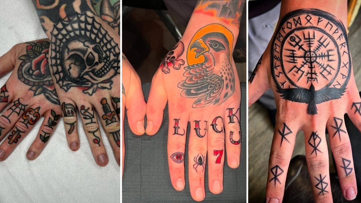
Heavy black ink settling into rough knuckles carries undeniable weight. You feel that raw permanence every time you grip a steering wheel. The experience mirrors walking into a moody, industrial loft space.
Hand pieces are not for the faint of heart. They signal absolute confidence instead. Men choosing this placement treat their skin like a prime focal wall. These designs work exceptionally well for creative professionals.
High Impact Placement Making Your Hands Speak Volumes
Treating your hands as a focal point requires the exact balance needed to anchor a large living room. Visual clutter muddies the overall message quickly. Sharp, deliberate lines create immediate, lasting impact instead.
You must consider how the ink flows with your natural bone structure. Knuckle lettering gives a grounded, masculine edge. The back of the hand offers a broader surface for rich, dark shading.
Hand Placement
1.Classic American Traditional Good Luck Knuckle Set
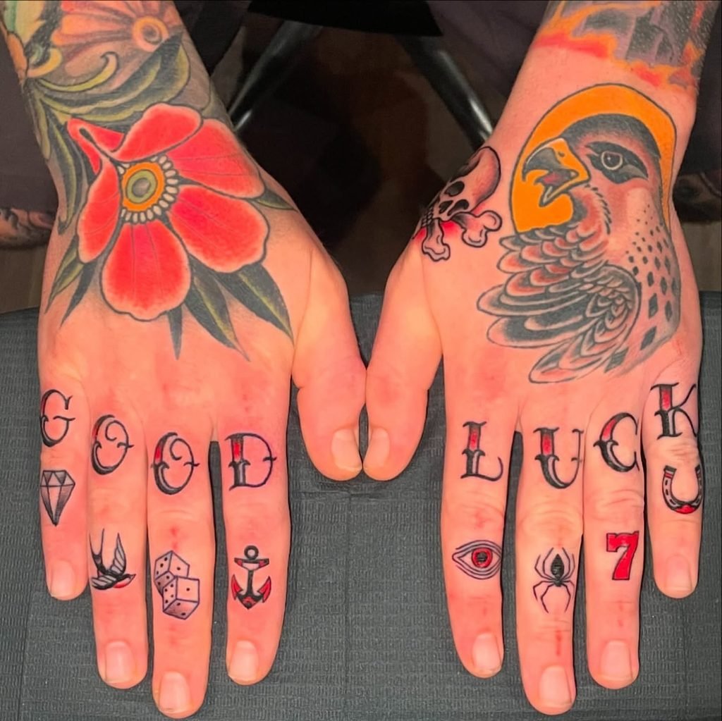
Rich red flower petals and a sharp hawk motif anchor the back of each hand with bold black linework. Crisp lettering spells out GOOD LUCK across the upper knuckles in classic script.
Pairing bold main hand motifs with compact finger filler creates a balanced full hand layout.
Combining a prominent hand piece with finger lettering gives you a complete, intentional finish down to the fingertips. Space small symbols evenly along the lower phalanges to maintain clean separation as your skin flexes.
2. Bold Red Rose With Stacked Knuckle Lettering
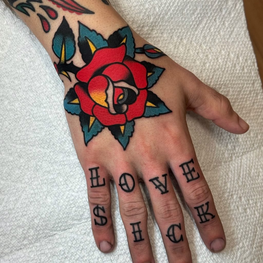
Deep crimson red ink fills the center rose with plush warmth alongside dark teal leaves. Solid black linework frames every petal while soft yellow shading adds rich depth.
Stacking two words across upper and lower finger joints creates a bold vertical rhythm.
Stacked finger words work best when you choose four-letter pairs with heavy serif fonts. Placing the main botanical piece on top stabilizes the layout and pulls eyes upward toward the wrist.
3. Spiderweb Skull And Micro Flash Finger Collection
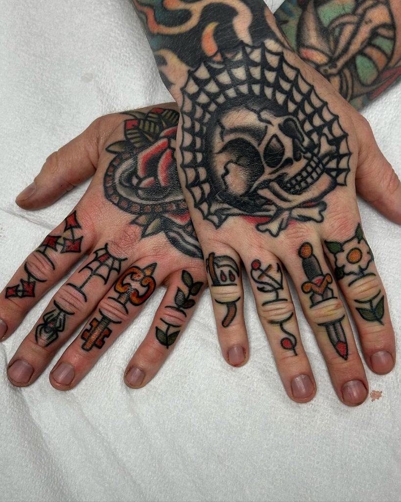
Chunky black linework builds a solid skull framed by a thick spiderweb across the right hand. Deep charcoal shading gives the web heavy dimension against crisp white skin.
Filling individual finger segments with micro flash icons creates a dense, museum-worthy flash collection.
Filling every phalanx with small self-contained artwork turns hands into a cohesive storybook. Solid black outlines keep small icons readable even when placed near joint folds.
Why This Works
Heavy black web lines establish a strong focal anchor across the main hand surface.
Small scale dagger and key motifs fit the natural proportions of individual finger bones cleanly.
Repeated pops of red and yellow ink create visual unity across both hands.
4. Dark Monochromatic Micro Icon Knuckle Layout
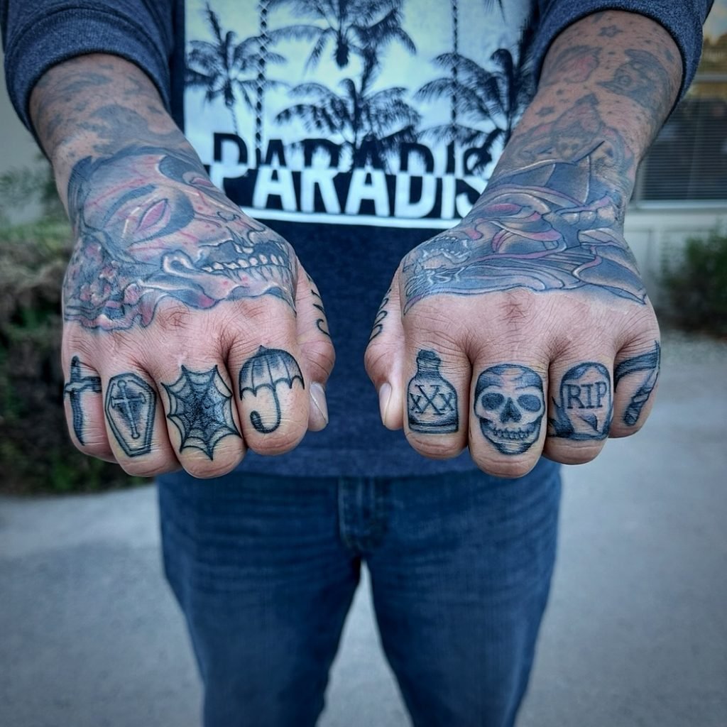
Soft grey shading fills each micro icon across eight distinct knuckle joints. Solid black outlines define a tiny umbrella, spiderweb, coffin, and dagger on the left fingers.
Grouping individual dark icons across all eight knuckles builds a cohesive thematic story.
Compact micro icons work best when you maintain uniform outline weight across every finger bone. Keeping shading light prevents dark ink from bleeding together as skin moves over the joints.
Quick Styling Tips
Budget version: Get all eight micro symbols done in a single sitting to reduce shop setup fees.
Renter tip: Test finger placement using temporary ink transfers before committing to permanent needle work.
Pro move: Add subtle red highlights on select icons to make individual shapes pop against grey shading.
5. Norse Vegvisir Compass With Bindrune Finger Markings
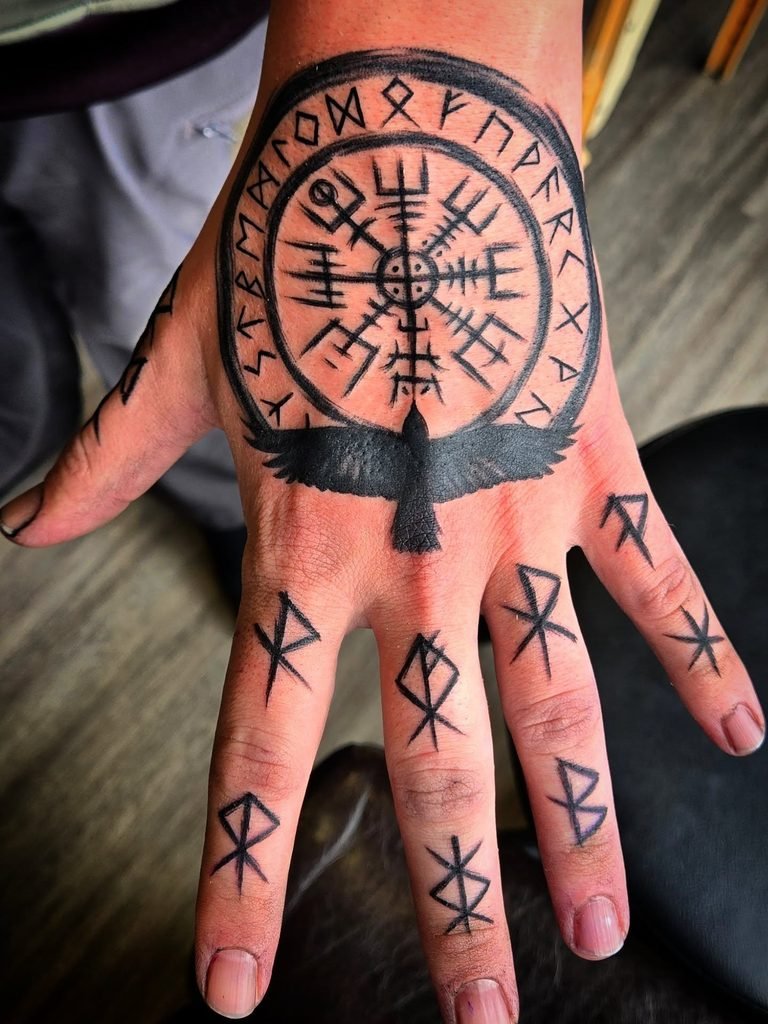
A circular Vegvisir compass rests in bold black linework on the back of the hand, framed by an intricate runic wheel. A solid black raven silhouette sits at the base of the central dial with crisp wing feathers.
Anchoring a circular focal piece on the main hand lets geometric finger runes extend the design naturally.
Circular hand tattoos work best when you center the main focal point right over the metacarpal bones. Spacing individual runes along the digits keeps the geometric symmetry clean across moving joints.
6. Traditional Swallow Motifs With Sailor Serif Knuckle Ink
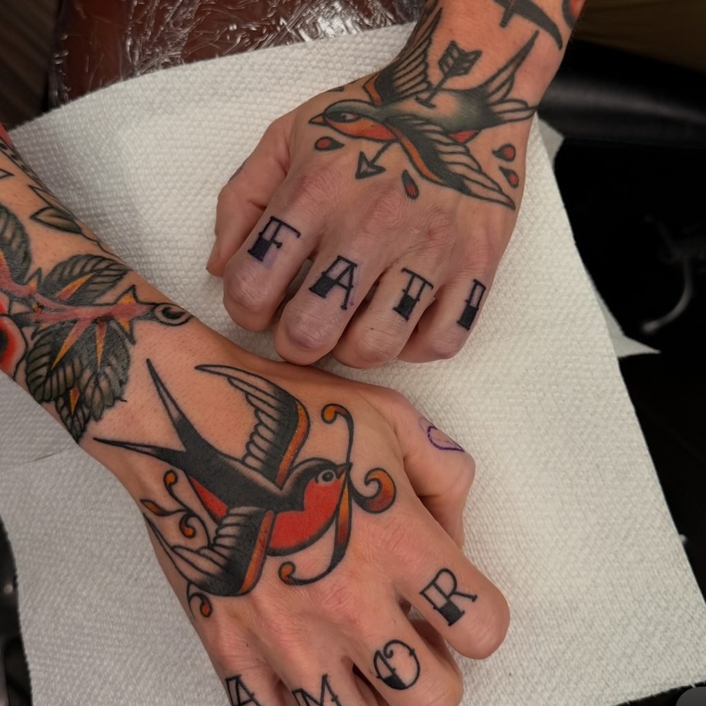
Bright red and warm golden orange shading fills the chest of a flying swallow across the lower hand. Solid black linework defines a second pierced bird above crisp lettering spelling out FATE and AMOR across both sets of knuckles.
Symmetrical sailor swallows paired with four-letter classic words create a grounded maritime layout.
Traditional swallows work best on the main hand flat because the broad wing shape covers metacarpal bones cleanly. Positioning high-contrast bold serif letters on upper finger segments keeps four-letter words readable while making gestures.
7. Traditional Flash Patchwork Collection With Vibrant Accents
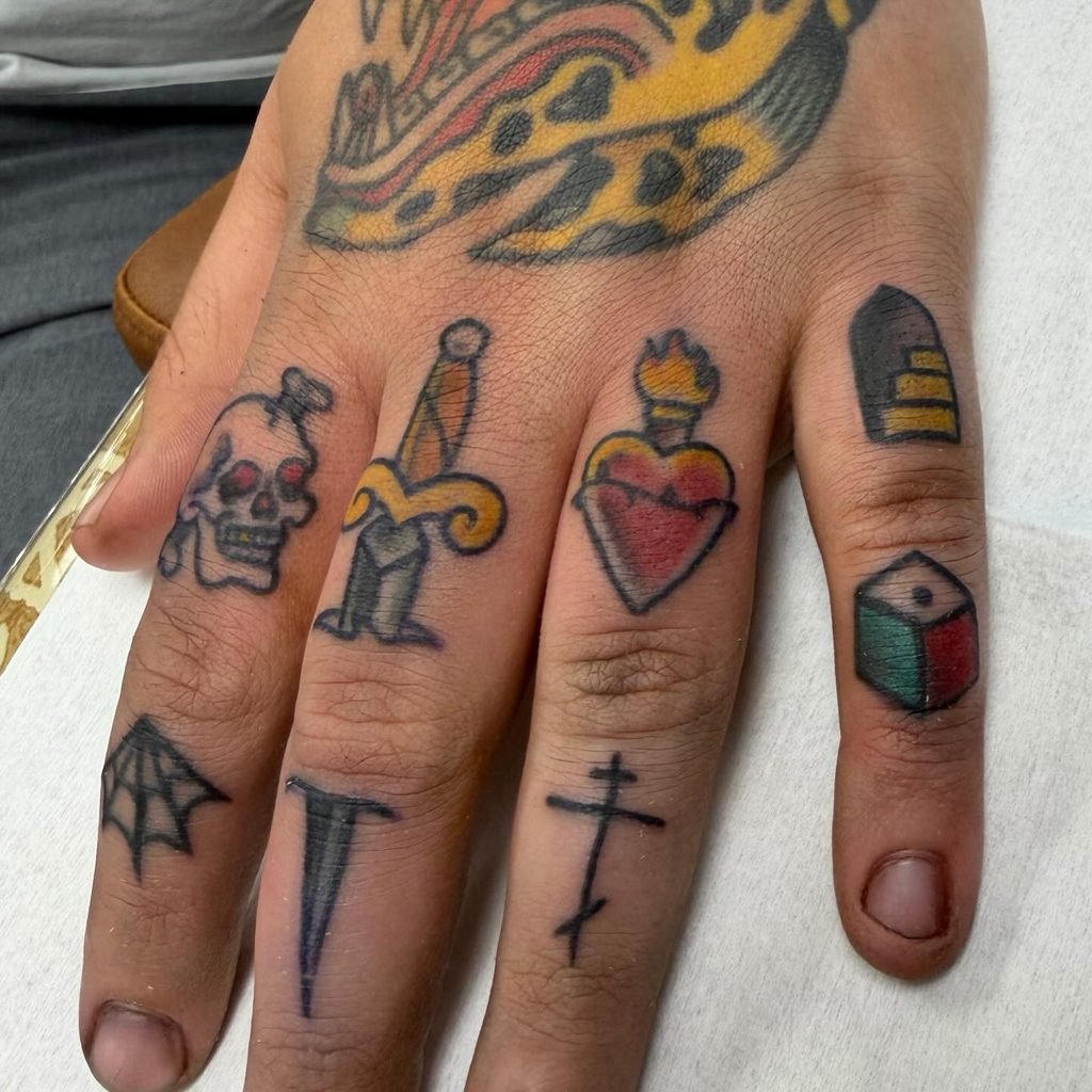
Bright yellow and crimson red ink fills a sacred heart and dagger motif across the upper joints. Bold black outlines frame a miniature skull, a 3D geometric cube, an Orthodox cross, and a half spiderweb.
Mixing unrelated traditional flash pieces across individual fingers creates a custom patchwork sleeve effect.
Patchwork finger collections work best when you vary the scale of icons between the upper and lower phalanges. Keep color palettes consistent across different symbols to tie disparate subjects into a unified visual theme.
8. Mixing Bold Geometry and Refined Knuckle Script
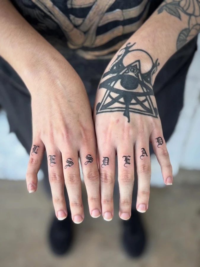
Heavy black lines ground this striking composition, where a complex geometric eye symbol dominates the left hand, contrasting sharply with the intricate, detailed lettering on the knuckles.
Mixing dense geometry with refined script on highly visible surfaces demands absolute confidence.
This approach is ideal for large, open-concept spaces like an active loft. Recreate this powerful mix by pairing one large, textured statement piece, such as a moody abstract canvas, with small, structured typography on adjacent accents.
9. Silhouetted Crosses With Heavy Lettering
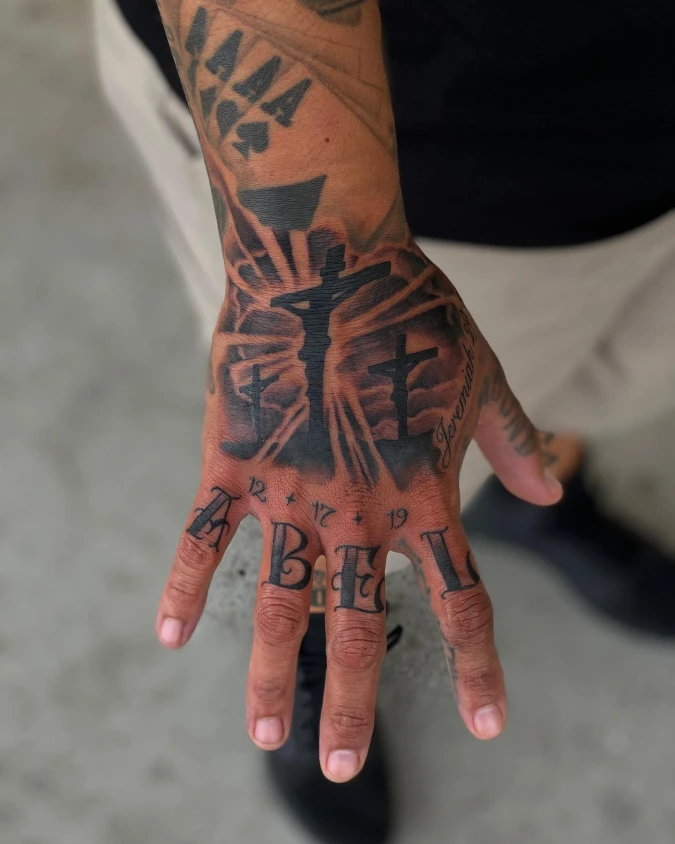
Deep black shading builds a moody landscape across the back of the hand. Crisp negative space rays cut through the heavy ink, bringing airy contrast to the warm skin.
Balance dense, dark focal points with deliberate negative space to keep a heavy design from feeling suffocating.
High-contrast shading techniques mirror the energy of a grounded masculine den. Rooms heavily layered in dark materials require bright, structural light sources to maintain visual harmony.
Why This Works
- Crisp un-inked light rays break up the dense background, functioning exactly like large, bare windows in a dark-painted room.
- Solid black silhouettes grab attention instantly, serving as the heavy anchor piece for the whole composition.
- Structured knuckle lettering provides a strong visual foundation, much like chunky oak baseboards framing a moody accent wall.
10. Eclectic Micro Symbols Across The Knuckles
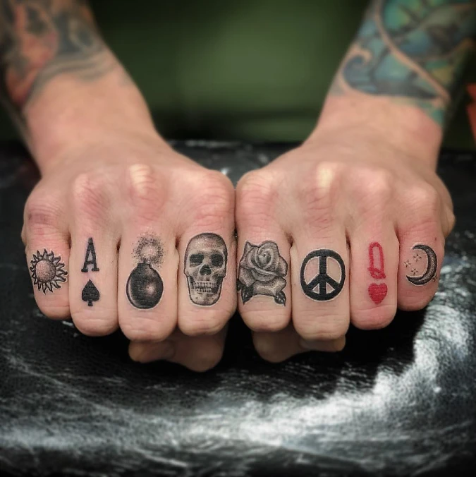
Small, distinct icons march uniformly across both hands, mixing sharp black lines with a sudden pop of red ink. A heavily shaded skull and a soft, textured rose sit side-by-side right at the center.
Treat small, unconnected designs like an eclectic collection by spacing them evenly along a natural grid.
This scattered approach brings bold, eclectic energy onto a rigid canvas. You can use this exact concept in a narrow hallway or directly above a low console table. Grouping mismatched vintage frames along a straight, horizontal sightline forces visual order onto otherwise chaotic elements.
Quick Styling Tips
- Budget version: Build a horizontal grid using small, thrifted postcards instead of buying one massive, expensive canvas.
- Renter tip: Hang tiny, framed sketches using removable adhesive strips right along the top edge of a painted border.
- Pro move: Add one unexpected burst of color, exactly like the red queen of hearts, to break up a rigid monochrome layout.
11. Oversized Gothic Monograms With Red Thorn Borders
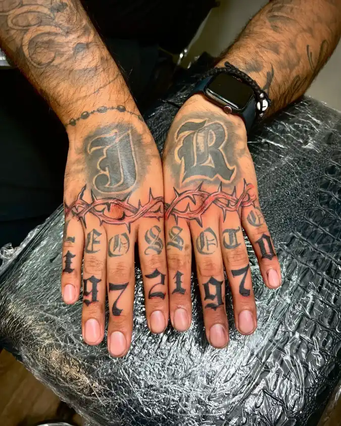
Heavy grey shading surrounds massive gothic initials on the back of each hand. A sharp, bloody-red crown of thorns cuts directly across the center, separating the top canvas from the knuckles.
Break up dense, heavy focal points using a thin, high-contrast horizontal line.
This aggressive layering strategy fits a moody, dark-toned home office. That sharp crimson border acts exactly like a vivid chair rail in a deeply painted room. It stops the eye from getting lost in the massive grey lettering above.
Quick Styling Tips
- Budget version: Paint a thin, high-gloss horizontal stripe across your hallway to divide dark upper and lower walls.
- Renter tip: Apply removable border tape to create a hard visual break between dense gallery wall frames.
- Pro move: Match your dividing line to one dominant accent color in the room, mirroring how the red ink pops against the black lettering.
12. Layered Knuckle Script And Geometric Card Suits
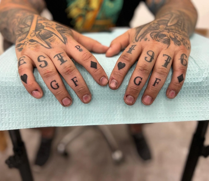
Crisp black numbers and letters stack vertically across two rows of knuckles. Solid geometric card suits anchor the edges of the lower fingers, adding unexpected visual weight to the arrangement. Heavy, faded shading on the upper hand provides a deep, grounded backdrop for the sharp typography below.
Anchor multiple rows of small, structured text with bold geometric shapes to maintain visual stability.
Stacking different fonts requires a strong grounding element to prevent the design from feeling chaotic. You see this exact principle in eclectic living rooms where heavy, solid-colored area rugs anchor busy gallery walls.
13. Hyper Realistic Skull And Shadowed Roses
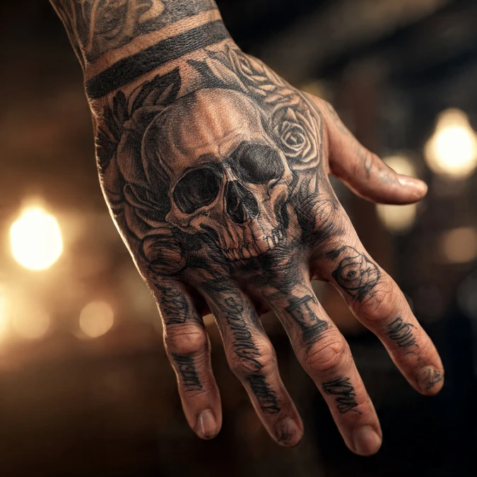
Heavy black shading builds a highly textured skull across the main canvas of the hand. Soft roses frame the rigid bone structure, adding lush contrast to the gritty centerpiece. Cursive script flows down the fingers like dark veins, pulling the eye straight toward the knuckles.
Pair an aggressive, heavy focal piece with soft, organic borders to keep the design from feeling flat.
This high-contrast mix succeeds in maximalist, moody spaces like a dimly lit library. You need organic shapes to soften rigid, overwhelming objects. Try flanking a massive, dark leather Chesterfield sofa with plush, trailing indoor plants to nail this exact balance.
Why This Works
Element 1: The dominant central skull acts as the heavy visual anchor, much like a massive stone fireplace in a dark room.
Element 2: Shadowed floral borders provide essential soft texture to break up the dense, hard lines of the bone structure.
Element 3: Flowing finger script draws the eyeline downward, grounding the top-heavy composition completely.
14. Traditional Color Blocks And Layered Typography
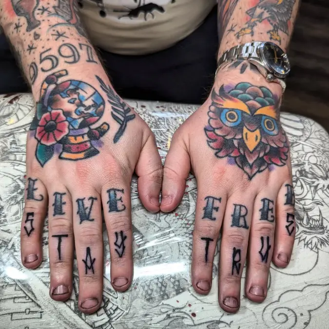
Saturated primary colors burst across the back of both hands in classic traditional tattoo style. Thick black outlines contain vibrant reds, deep blues, and warm yellows within the owl and floral globe designs.
Contain bright, aggressive colors within thick, dark borders to keep bold palettes from feeling chaotic.
This high-energy approach works brilliantly in active spaces like a family playroom or a creative studio. You need strong visual boundaries when mixing highly saturated hues.
Quick Styling Tips
- Budget version: Frame bright, inexpensive primary-color art prints using chunky black gallery frames.
- Renter tip: Anchor a colorful, removable wallpaper accent wall with a dark, solid-toned sofa.
- Pro move: Match your boldest accent color to a secondary element, exactly like the red flower mirrors the red feathers in the owl.
15. Fresh Gothic Typography Over Faded Background Ink
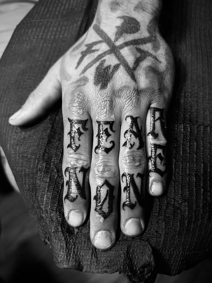
Glossy black ink spells a commanding message down two joints of the fingers. A weathered, faded emblem sits quietly on the back of the hand, providing a dusty gray backdrop.
Layer sharp, brand-new focal points over weathered foundations to give a space instant historic depth.
Mixing fresh elements with heavily distressed backgrounds keeps a room from feeling overly sterile. You see this exact tension in converted warehouse lofts where modern matte-black fixtures mount directly onto crumbling brick walls.
Why This Works
Element 1: Crisp, dark lettering pulls the eye immediately forward, acting like a heavy black console table anchoring a room.
Element 2: Faded background ink provides subtle texture without competing for attention, much like a muted vintage rug.
Element 3: Stacking two distinct words creates a solid vertical grid, grounding the busy visual noise of the underlying canvas.
16. Structured Stag Portrait With Sprawling Antlers
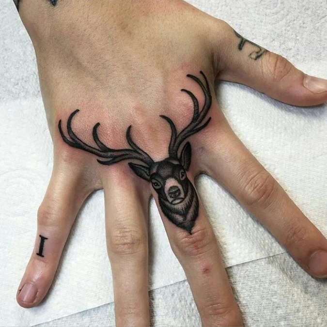
Dense black shading builds a highly structured stag face right on the middle finger knuckle. Sharp, curving antlers reach aggressively across the upper hand canvas, framing the bare skin like organic architecture.
Let existing structural boundaries dictate where you place your heaviest focal points.
Forcing a heavy centerpiece onto a narrow vertical plane commands immediate attention. You see this exact logic in modern cabins where a heavy, dark stovepipe anchors a slim wall section.
Quick Styling Tips
- Budget version: Center a single, heavily textured thrift store portrait on a narrow wall column to establish an instant visual anchor.
- Renter tip: Mount lightweight, sprawling faux branches above a slim bookcase to mimic how those dark antlers stretch across the wider hand canvas.
- Pro move: Leave the immediate surrounding areas completely bare, reflecting how the open skin makes the central stag pop so aggressively.
17. Massive Blackwork Lettering Down The Fingers
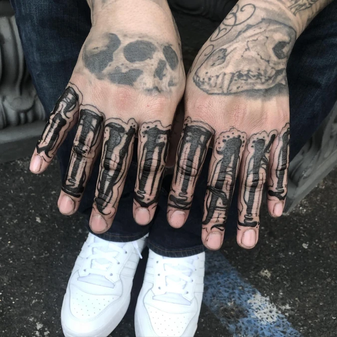
Massive blocks of solid black ink flood the entire length of each finger. A thin, deliberate outline wraps around these heavy shapes, keeping the outer edges remarkably crisp against the bare skin.
Ground an open room by stretching one heavy, high-contrast element vertically from floor to ceiling.
Elongating a solid dark focal point commands attention immediately. You see this architectural technique in modern lofts where thick steel pillars run straight down the walls.