Rolling up your shorts reveals a private gallery of bold art. The hum of the machine leaves behind crisp lines, heavy black work, and soft grey shading against bare skin.
Thigh tattoos give you ultimate control over visibility. You show them off at the beach and cover them up effortlessly for the office. Broad muscle groups here provide a forgiving canvas for large-scale pieces or staggered patch-style collections.
Mastering Placement Big Impact Thigh Tattoo Tricks
Treating this body part like a blank wall changes how you approach the ink. You must consider muscle curvature and how the design wraps around the leg.
Centered front pieces ground the entire leg visually. Side placements emphasize length and create dynamic movement when you walk.
1. Geometric Thigh Band Wrap
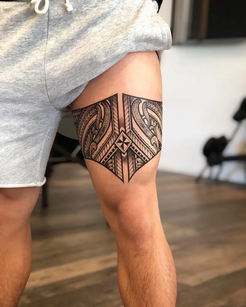
Thick black ink forms a sharp, symmetrical band across the mid-thigh. Dense tribal patterns fill the rigid outer borders using crisp, textured linework. Negative space acts like bare walls in a well-styled room, providing crucial breathing room against heavy shading.
Rigid geometric borders keep complex interior patterns looking highly intentional and grounded.
Wrapping a solid piece around the leg requires strict alignment to prevent visual warping when you move. This horizontal structure anchors your upper leg, much like a dark rug grounds a bright living room.
2. Abstract Framed Military Portrait
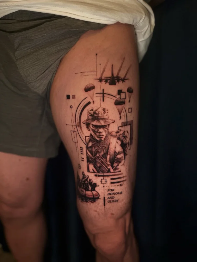
Fine linework builds a sharp geometric frame around a softly shaded soldier. Paratroopers drop through the airy upper space while dark ink anchors a boat scene near the knee.
Sharp architectural lines prevent layered portraits from feeling cluttered or heavy.
Grouping smaller elements requires a strong visual boundary. This vertical layout acts like a tall bookcase, drawing the eye down the natural length of the leg. You can use this structural trick to combine multiple small ideas into one cohesive focal point.
3. Floating Roman Numeral Text
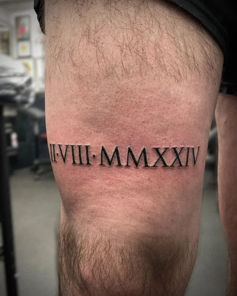
Crisp black lettering cuts straight across the lower quad. Soft grey shading drops just beneath the thick numbers, creating a distinct three-dimensional illusion. Bare skin surrounds the text completely, leaving a clean and airy finish.
Floating shadows turn basic typography into a physical architectural element.
Placement dictates everything with straight horizontal lettering. Centering the text on the flattest part of the thigh prevents the ink from bending out of shape. You can treat this approach like hanging a single minimalist print on a wide gallery wall.
Why This Works
Element 1: Drop shadows anchor the heavy black ink against your natural skin tone.
Element 2: Strict horizontal alignment grounds the design amidst the curved leg muscle.
Element 3: Generous negative space around the text prevents the piece from feeling cramped.
4. Tribal Wave Leg Contour
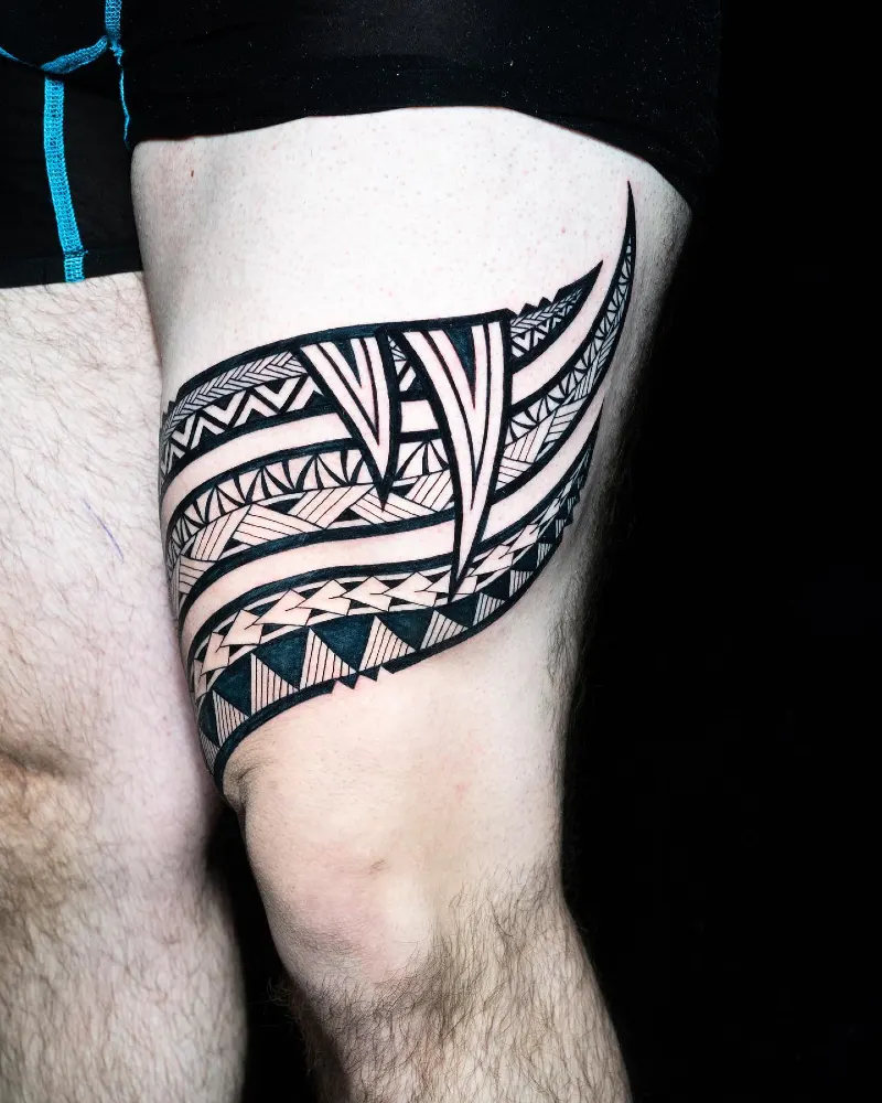
Sweeping black lines trace the natural muscle curve. Dense geometric triangles contrast sharply against wide ribbons of bare skin. Pointed vertical hooks slice down through the horizontal layers, breaking up the heavy organic flow.
Dynamic curves act like architectural arches to soften rigid structural spaces.
Designing with your body’s natural topography creates fluid movement instead of a static block. You can adapt this wrapped layout to camouflage awkward gaps between older ink patches.
Quick Styling Tips
- Budget version: Outline the major wave shapes first and save the dense interior shading for a second session.
- Renter tip: Test the bold placement using temporary black ink before committing to a massive permanent piece.
- Pro move: Ask the artist to freehand the final outer sweeps so they match your exact muscle definition.
5. Split Fine Line Celestial Compass
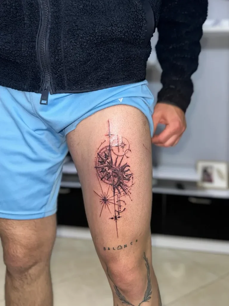
A razor-sharp vertical axis splits this delicate thigh piece directly down the left side houses a crisp nautical compass, while the right displays a softly shaded sun face wrapped in geometric dots.
Symmetrical split designs act like a two-tone accent wall, balancing contrasting moods inside one unified frame.
Fine linework needs a flat, stable surface to maintain strict geometry as your body moves. The front of the quad provides a rock-solid foundation for mapping out intricate, delicate sketches.
6. Mixed Typography Quote and Numbers
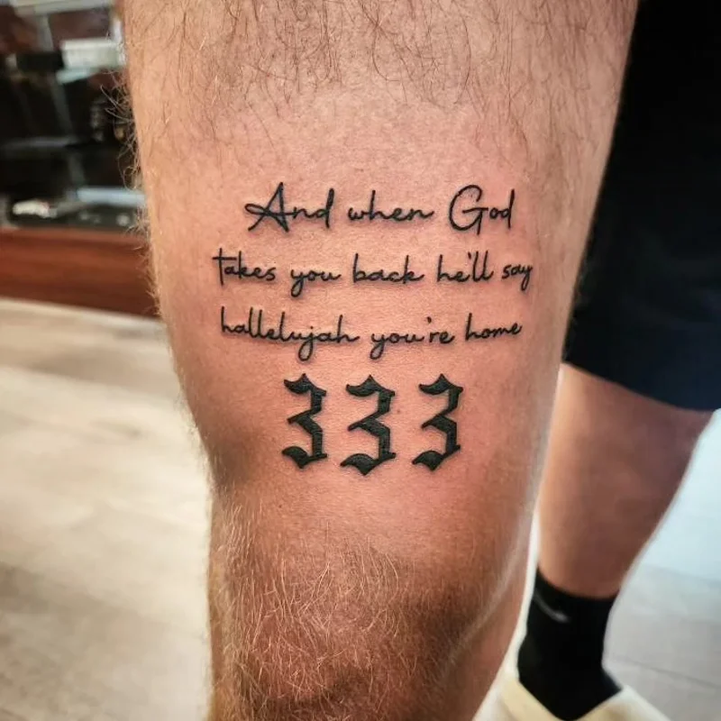
Fine cursive lettering flows gently across the upper leg in heavy Gothic numbers sit directly below the quote, providing a dark, grounded base. Generous negative space separates these distinct fonts to keep the composition crisp and legible.
Mixing font weights works just like pairing a chunky knit throw with a crisp linen sofa.
Combining different text styles adds immediate depth to a flat word-based tattoo. You should always place the heavier ink at the bottom to stop the design from feeling top-heavy.
Why This Works
Element 1: Contrasting font weights create a natural visual hierarchy without needing extra shading.
Element 2: Horizontal text alignment works directly with the natural width of the thigh.
Element 3: Thick bottom numbers act as a strong structural foundation for the airy cursive above.
7. Fine Line Diagram Collage
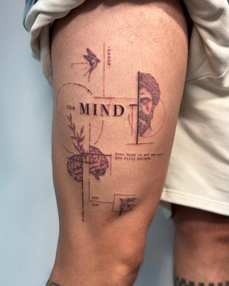
Fine black ink maps out a complex web of thoughts across the front quad. A classical bust and an anatomical brain sit cleanly sliced by sharp vertical axes, while soft swallows float through the upper negative space.
Thin geometric guide lines act like open shelving, displaying disconnected objects in a structured, deliberate way.
Spacing matters immensely when compiling a patchwork collage on a large leg muscle. You must rely on strict horizontal and vertical alignments to frame the floating illustrations properly.
8. Asymmetrical Fine Line Dual Canvas
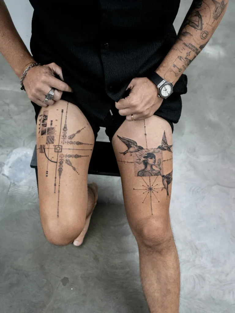
Crisp black linework spans across both thighs in a balanced but mismatched composition. The right leg anchors a softly shaded portrait inside a rigid square, surrounded by dark flying birds.
Symmetrical placement grounds radically different designs to keep the overall look cohesive.
Treating both legs as a single combined canvas lets you mix contrasting concepts without creating chaos. This dual-pane approach works well for anyone wanting to pair sharp abstract geometry with soft realistic elements.
Why This Works
Element 1: Consistent line weights tie the abstract shapes and realistic bird portraits together naturally.
Element 2: Long vertical guide lines draw the eye straight down the natural length of the quad.
Element 3: Rigid square frames contain the soft internal shading to maintain wide margins of bare skin.
9. Heavy Custom Script Wrap
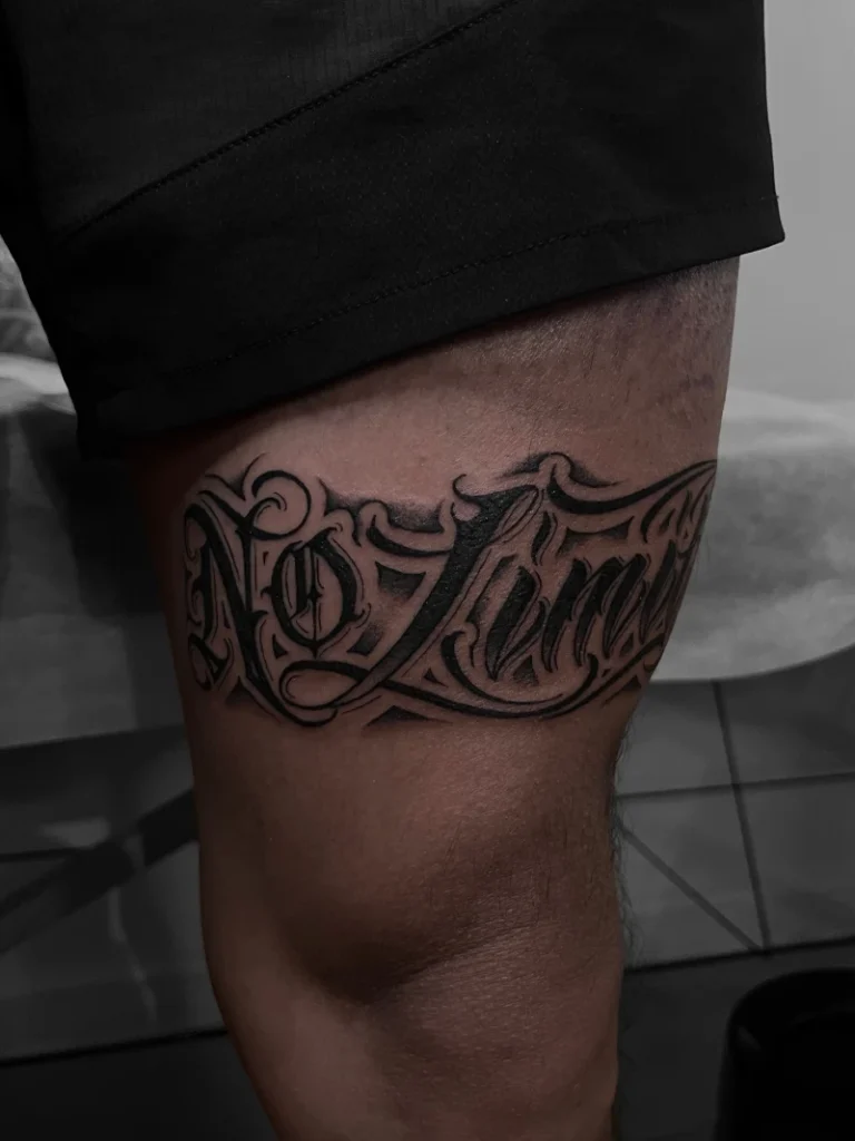
Thick, aggressive black work forms dense cursive lettering across the lower thigh. Heavy grey shading drops beneath the sweeping script, pushing the bold letters forward against the bare skin.
Deep background shadows turn flat typography into a high-contrast, physical focal point.
Treating a text tattoo like a solid block of art works exactly like hanging a massive, dark painting in a crisp, bright living room. You need wide margins of empty skin above and below to keep the heavy ink from feeling crowded.
Why This Works
Element 1: Dense black fill creates a strong visual anchor that demands immediate attention.
Element 2: Soft background shading mimics architectural depth to separate the words from the flat muscle.
Element 3: Sweeping cursive curves soften the harsh impact of the highly saturated ink.
10. Realistic Lion Portrait With Skin Rips
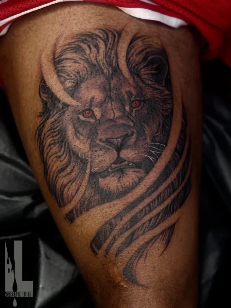
Heavy black and grey shading builds a deeply textured lion face across the upper leg. Piercing red ink highlights the eyes, breaking up the dense monochromatic palette.
High-contrast focal points pull the eye immediately into the center of a dark composition.
Packing solid ink into a large muscle requires strategic visual breaks to keep it from looking like a flat shadow. Leaving wide streaks of bare skin mimics the effect of hanging a heavy, dark tapestry against a crisp white wall.
Quick Styling Tips
- Budget version: Focus purely on the central facial structure and red eyes first, saving the outer mane and skin rips for a later session.
- Renter tip: Test the heavy scale of an animal portrait using a large temporary transfer before committing to massive blackwork.
- Pro move: Ask your artist to use your natural skin tone as the brightest highlight to avoid unnecessary and painful white ink packing.
11. Mirrored Custom Script Placement
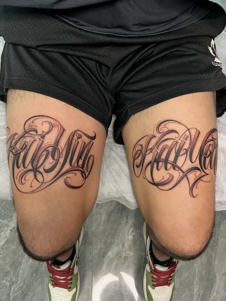
Sweeping black cursive stretches widely across the front of both legs. Deep shading anchors the thickest loops, while delicate fine lines taper into the bare skin.
Matching identical designs across two separate spaces creates deliberate visual harmony.
Treating both legs as a mirrored set works exactly like flanking a wide window with identical heavy drapes. This balanced approach delivers massive impact without feeling chaotic.
12. Abstract Fine Line Starburst
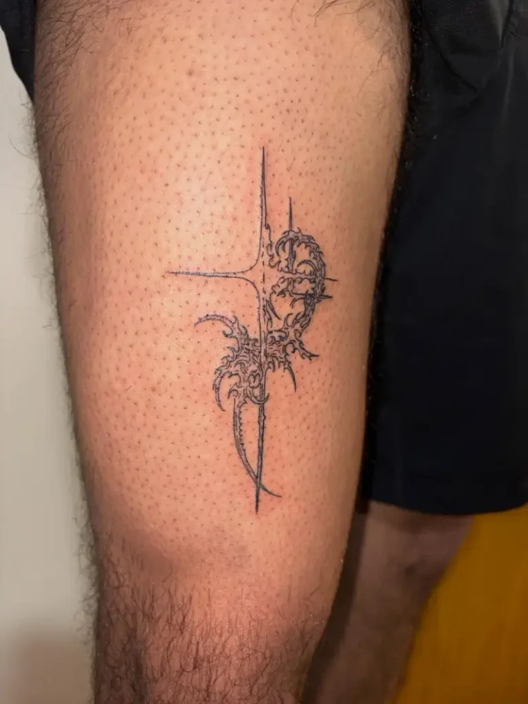
Razor-thin black ink etches a sharp vertical cross across the mid-thigh. Delicate, thorny wisps wrap around the right side of the rigid axis to create organic movement.
Mixing rigid geometry with organic curves creates instant visual balance in any empty space.
You need plenty of breathing room to make micro-detail work successfully. This layout acts like a minimalist wire sculpture sitting on a wide, clear console table. Leaving the surrounding area entirely empty ensures the wispy edges stay crisp and highly legible over time.
Why This Works
Element 1: Sharp central lines ground the chaotic outer loops with strong structural boundaries.
Element 2: Generous negative space stops the fine needlework from feeling visually heavy.
Element 3: Mid-thigh placement provides a stable, flat surface to support delicate vertical geometry.
13. Neo Traditional Colorful Portrait

Muted green and rich yellow pigments fill a bold portrait across the upper leg. Heavy black outlines trap the solid colors, creating a structured, stained-glass effect.
Thick black borders act like sturdy wooden frames to keep vibrant colors tightly contained.
Dropping a highly saturated piece onto a wide muscle demands complete commitment. You treat this approach like painting a bold accent wall in a crisp, bright room.
14. Massive Tribal Leg Wrap
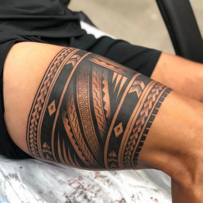
Massive blocks of solid black ink wrap entirely around the upper leg. Intricate woven lines and sharp geometric arrows break up the heavy dark sections. Warm bare skin peeks through the dense layers, providing sharp contrast against the deeply saturated shading.
Thick structural borders act like heavy crown molding to frame busy internal patterns.
Anchoring a massive sleeve requires wide, solid edges to keep the complex interior organized. You approach this layout exactly like rolling out a dark, heavy area rug in a sparse room.
Quick Styling Tips
- Budget version: Outline the main horizontal borders first and fill the intricate interior patterns during a later session.
- Renter tip: Draw the thickest bands with a bold temporary marker to ensure they complement your natural muscle curvature.
- Pro move: Leave wider margins of empty skin between the darkest elements so the shapes stay highly readable over time.
15. Structured Thorn Band Wrap
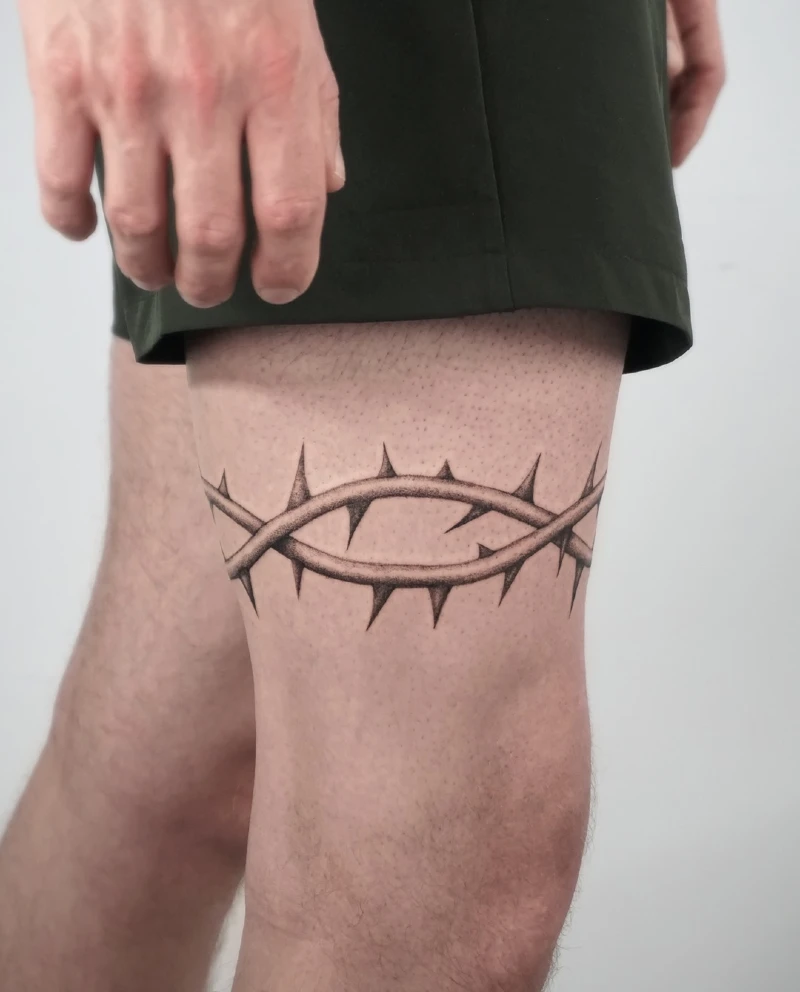
Soft grey shading builds a realistic, three-dimensional band of thorns across the mid-thigh. Sharp spikes jut out from the thick vines to break up the smooth horizontal flow.
Leaving wide margins of empty space turns a simple wrap into a striking architectural border.
Centering a structured band on the lower quad works exactly like installing a dark chair rail in a crisp dining room. This horizontal layout anchors the leg visually without demanding a massive full-sleeve commitment.
16. Heavy Drop Shadow Gothic Lettering
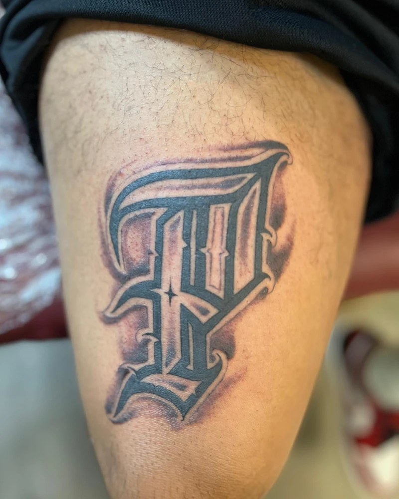
Thick black ink shapes a single, massive Gothic letter across the bare quad. Soft grey shading blooms directly behind the sharp linework, creating an aggressive three-dimensional drop shadow.
Drop shadows push flat text forward, much like backlighting a bold piece of wall art.
Anchoring a single giant initial requires extreme confidence in your placement. You treat this layout exactly like hanging a solitary, oversized mirror in a sparse hallway.
Why This Works
Element 1: Deep background shading lifts the sharp black outline away from your natural skin tone.
Element 2: Massive scale prevents the intricate Gothic styling from bleeding together over time.
Element 3: Generous empty borders act as a built-in frame for the standalone character.
17. Minimalist Black Ink Lightning Bolt
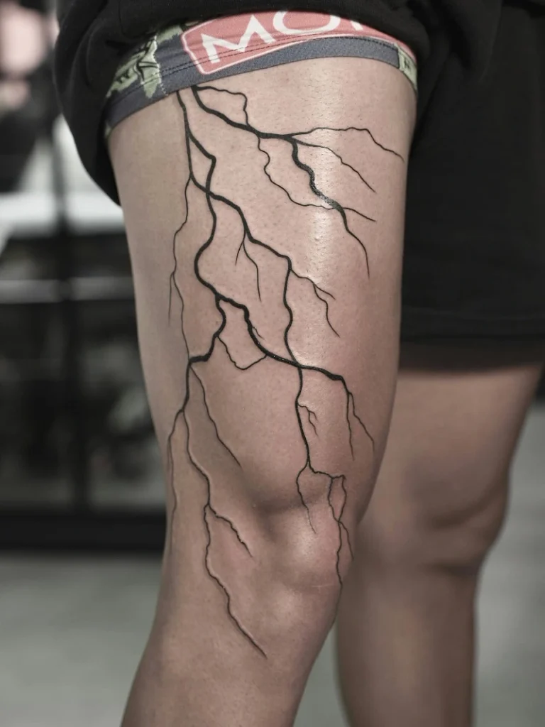
Jagged black lines crack down the entire length of the upper leg. Crisp ink branches out randomly across the wide expanse of bare skin. The complete lack of shading keeps this massive piece feeling airy and lightweight.
Unstructured organic lines act like trailing ivy, adding sweeping movement without overwhelming the natural space.
Spreading a sparse design across a huge canvas works exactly like hanging a delicate, oversized paper lantern in a lofty living room. You get massive scale without the heavy visual weight of a solid blackwork piece.
Quick Styling Tips
- Budget version: Outline the main central crack first and add the smaller branching veins during a follow-up visit.
- Renter tip: Map the jagged path with a soft eyeliner pencil to see how the lines warp when you bend your knee.
- Pro move: Ask your artist to keep the line weight slightly thicker near the top to ground the design visually.